Bar Charts – The king of plots?
The ability to render a bar chart quickly and easily from data in Pandas DataFrames is a key skill for any data scientist working in Python.
Nothing beats the bar chart for fast data exploration and comparison of variable values between different groups, or building a story around how groups of data are composed. Often, at EdgeTier, we tend to end up with an abundance of bar charts in both exploratory data analysis work as well as in dashboard visualisations.
The advantage of bar charts (or “bar plots”, “column charts”) over other chart types is that the human eye has evolved a refined ability to compare the length of objects, as opposed to angle or area.
Luckily for Python users, options for visualisation libraries are plentiful, and Pandas itself has tight integration with the Matplotlib visualisation library, allowing figures to be created directly from DataFrame and Series data objects. This blog post focuses on the use of the DataFrame.plot functions from the Pandas visualisation API.
Editing environment
As with most of the tutorials in this site, I’m using a Jupyter Notebook (and trying out Jupyter Lab) to edit Python code and view the resulting output. You can install Jupyter in your Python environment, or get it prepackaged with a WinPython or Anaconda installation (useful on Windows especially).
To import the relevant libraries and set up the visualisation output size, use:
# Set the figure size - handy for larger output
from matplotlib import pyplot as plt
plt.rcParams["figure.figsize"] = [10, 6]
# Set up with a higher resolution screen (useful on Mac)
%config InlineBackend.figure_format = 'retina'
Getting started: Bar charting numbers
The simplest bar chart that you can make is one where you already know the numbers that you want to display on the chart, with no calculations necessary. This plot is easily achieved in Pandas by creating a Pandas “Series” and plotting the values, using the kind="bar" argument to the plotting command.
For example, say you wanted to plot the number of mince pies eaten at Christmas by each member of your family on a bar chart. (I have no idea why you’d want to do that!) Imagine you have two parents (ate 10 each), one brother (a real mince pie fiend, ate 42), one sister (scoffed 17), and yourself (also with a penchant for the mince pie festive flavours, ate 37).
To create this chart, place the ages inside a Python list, turn the list into a Pandas Series or DataFrame, and then plot the result using the Series.plot command.
# Import the pandas library with the usual "pd" shortcut
import pandas as pd
# Create a Pandas series from a list of values ("[]") and plot it:
pd.Series([65, 61, 25, 22, 27]).plot(kind="bar")
A Pandas DataFrame could also be created to achieve the same result:
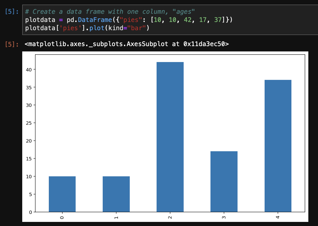
# Create a data frame with one column, "ages"
plotdata = pd.DataFrame({"ages": [65, 61, 25, 22, 27]})
plotdata.plot(kind="bar")
Dataframe.plot.bar()
For the purposes of this post, we’ll stick with the .plot(kind="bar") syntax; however; there are shortcut functions for the kind parameter to plot(). Direct functions for .bar() exist on the DataFrame.plot object that act as wrappers around the plotting functions – the chart above can be created with plotdata['pies'].plot.bar(). Other chart types (future blogs!) are accessed similarly:
df = pd.DataFrame()
# Plotting functions:
df.plot.area     df.plot.barh     df.plot.density  df.plot.hist     df.plot.line     df.plot.scatter
df.plot.bar      df.plot.box      df.plot.hexbin   df.plot.kde      df.plot.pie
Bar labels in charts
By default, the index of the DataFrame or Series is placed on the x-axis and the values in the selected column are rendered as bars. Every Pandas bar chart works this way; additional columns become a new sets of bars on the chart.
To add or change labels to the bars on the x-axis, we add an index to the data object:
# Create a sample dataframe with an text index
plotdata = pd.DataFrame(
    {"pies": [10, 10, 42, 17, 37]},
    index=["Dad", "Mam", "Bro", "Sis", "Me"])
# Plot a bar chart
plotdata.plot(kind="bar")
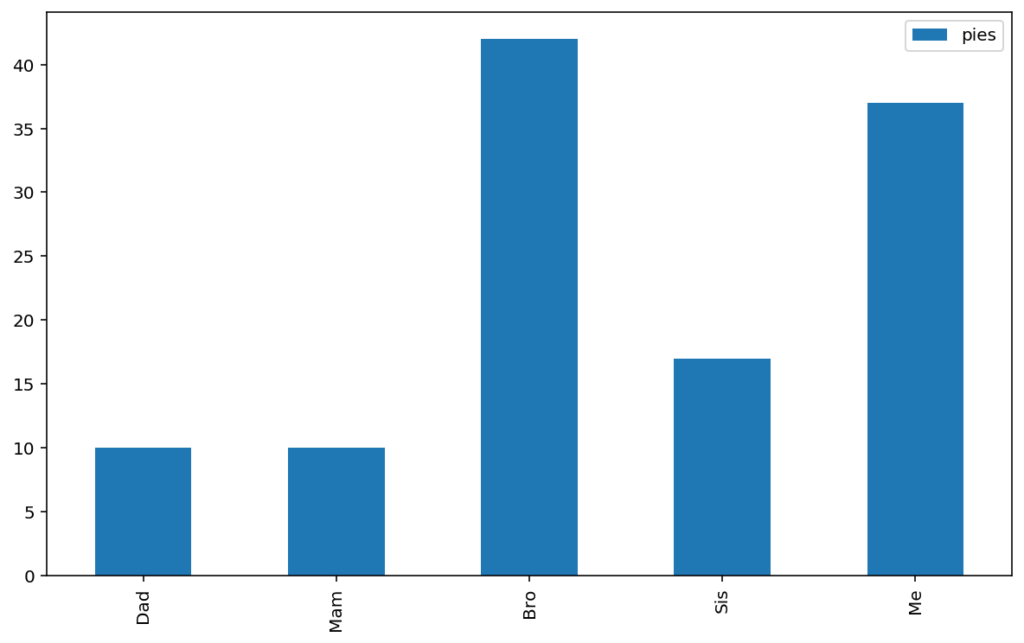
Note that the plot command here is actually plotting every column in the dataframe, there just happens to be only one. For example, the same output is achieved by selecting the “pies” column:
# Individual columns chosen from the DataFrame
# as Series are plotted in the same way:
plotdata['pies'].plot(kind="bar")
In real applications, data does not arrive in your Jupyter notebook in quite such a neat format, and the “plotdata” DataFrame that we have here is typically arrived at after significant use of the Pandas GroupBy, indexing/iloc, and reshaping functionality.
Labelling axes and adding plot titles
No chart is complete without a labelled x and y axis, and potentially a title and/or caption. With Pandas plot(), labelling of the axis is achieved using the Matplotlib syntax on the “plt” object imported from pyplot. The key functions needed are:
from matplotlib import pyplot as plt
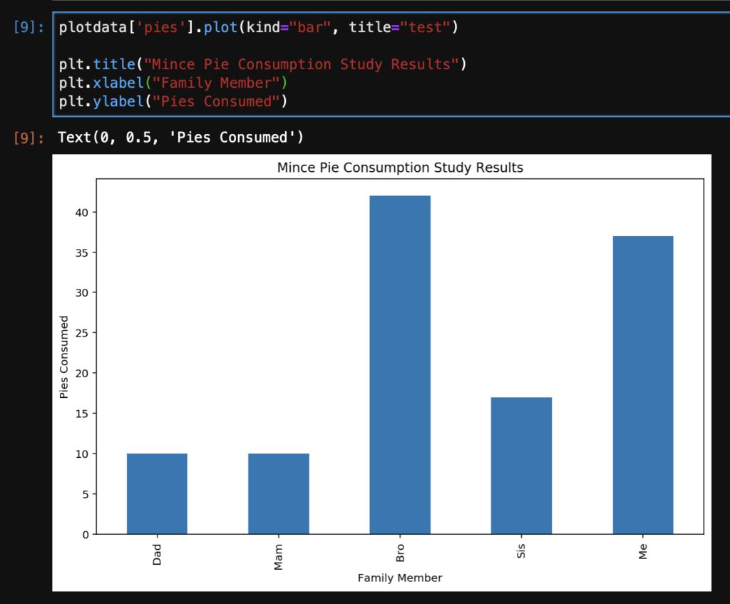
plotdata['pies'].plot(kind="bar", title="test")
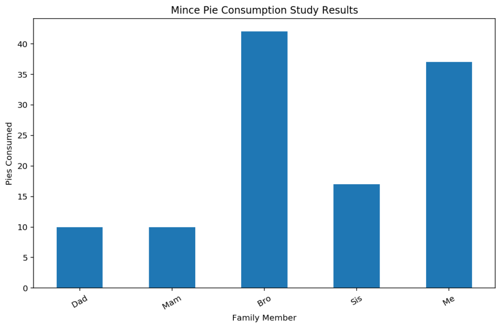
plt.title("Mince Pie Consumption Study Results")
plt.xlabel("Family Member")
plt.ylabel("Pies Consumed")
Rotate the x-axis labels
If you have datasets like mine, you’ll often have x-axis labels that are too long for comfortable display; there’s two options in this case – rotating the labels to make a bit more space, or rotating the entire chart to end up with a horizontal bar chart. The xticks function from Matplotlib is used, with the rotation and potentially horizontalalignment parameters.
plotdata['pies'].plot(kind="bar", title="test")
# Rotate the x-labels by 30 degrees, and keep the text aligned horizontally
plt.xticks(rotation=30, horizontalalignment="center")
plt.title("Mince Pie Consumption Study Results")
plt.xlabel("Family Member")
plt.ylabel("Pies Consumed")
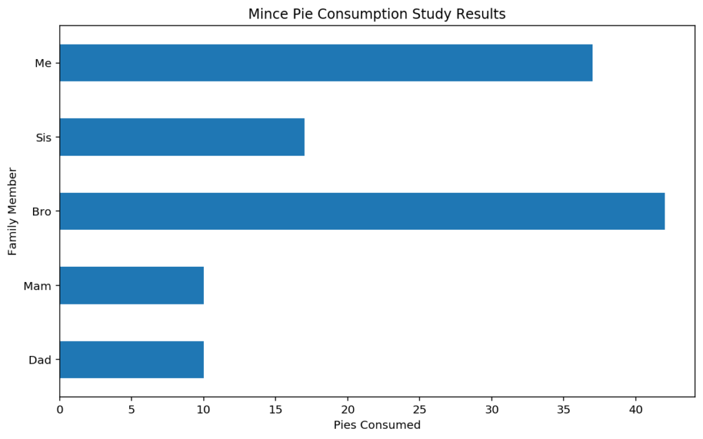
Horizontal bar charts
Rotating to a horizontal bar chart is one way to give some variance to a report full of of bar charts! Horizontal charts also allow for extra long bar titles. Horizontal bar charts are achieved in Pandas simply by changing the “kind” parameter to “barh” from “bar”.
Remember that the x and y axes will be swapped when using barh, requiring care when labelling.
plotdata['pies'].plot(kind="barh")
plt.title("Mince Pie Consumption Study Results")
plt.ylabel("Family Member")
plt.xlabel("Pies Consumed")
Additional series: Stacked and unstacked bar charts
The next step for your bar charting journey is the need to compare series from a different set of samples. Typically this leads to an “unstacked” bar plot.
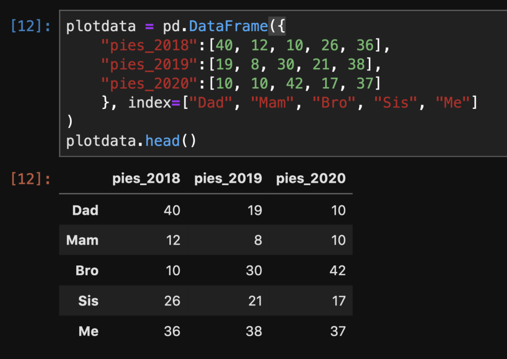
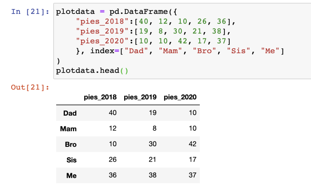
Let’s imagine that we have the mince pie consumption figures for the previous three years now (2018, 2019, 2020), and we want to use a bar chart to display the information. Here’s our data:
# Create a DataFrame with 3 columns:
plotdata = pd.DataFrame({
    "pies_2018":[40, 12, 10, 26, 36],
    "pies_2019":[19, 8, 30, 21, 38],
    "pies_2020":[10, 10, 42, 17, 37]
    },
    index=["Dad", "Mam", "Bro", "Sis", "Me"]
)
plotdata.head()
Unstacked bar plots
Out of the box, Pandas plot provides what we need here, putting the index on the x-axis, and rendering each column as a separate series or set of bars, with a (usually) neatly positioned legend.
plotdata = pd.DataFrame({
    "pies_2018":[40, 12, 10, 26, 36],
    "pies_2019":[19, 8, 30, 21, 38],
    "pies_2020":[10, 10, 42, 17, 37]
    },
    index=["Dad", "Mam", "Bro", "Sis", "Me"]
)
plotdata.plot(kind="bar")
plt.title("Mince Pie Consumption Study")
plt.xlabel("Family Member")
plt.ylabel("Pies Consumed")
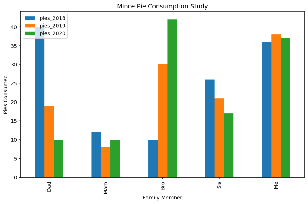
The unstacked bar chart is a great way to draw attention to patterns and changes over time or between different samples (depending on your x-axis). For example, you can tell visually from the figure that the gluttonous brother in our fictional mince-pie-eating family has grown an addiction over recent years, whereas my own consumption has remained conspicuously high and consistent over the duration of data.
With multiple columns in your data, you can always return to plot a single column as in the examples earlier by selecting the column to plot explicitly with a simple selection like plotdata['pies_2019'].plot(kind="bar").
Stacked bar plots
In the stacked version of the bar plot, the bars at each index point in the unstacked bar chart above are literally “stacked” on top of one another.
While the unstacked bar chart is excellent for comparison between groups, to get a visual representation of the total pie consumption over our three year period, and the breakdown of each persons consumption, a “stacked bar” chart is useful.
Pandas makes this easy with the “stacked” argument for the plot command. As before, our data is arranged with an index that will appear on the x-axis, and each column will become a different “series” on the plot, which in this case will be stacked on top of one another at each x-axis tick mark.
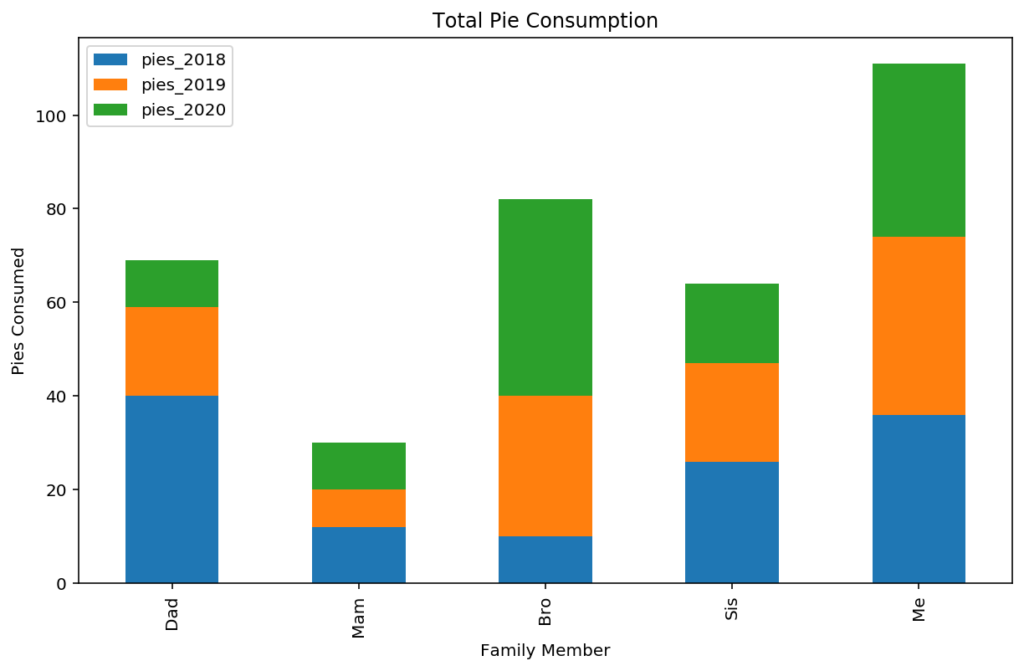
# Adding the stacked=True option to plot()
# creates a stacked bar plot
plotdata.plot(kind='bar', stacked=True)
plt.title("Total Pie Consumption")
plt.xlabel("Family Member")
plt.ylabel("Pies Consumed")
Ordering stacked and unstacked bars
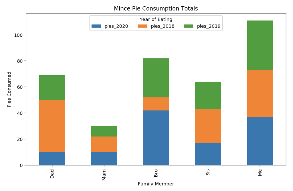
The order of appearance in the plot is controlled by the order of the columns seen in the data set. Re-ordering can be achieved by selecting the columns in the order that you require. Note that the selection column names are put inside a list during this selection example to ensure a DataFrame is output for plot():
# Choose columns in the order to "stack" them
plotdata[["pies_2020", "pies_2018", "pies_2019"]].plot(kind="bar", stacked=True)
plt.title("Mince Pie Consumption Totals")
plt.xlabel("Family Member")
plt.ylabel("Pies Consumed")
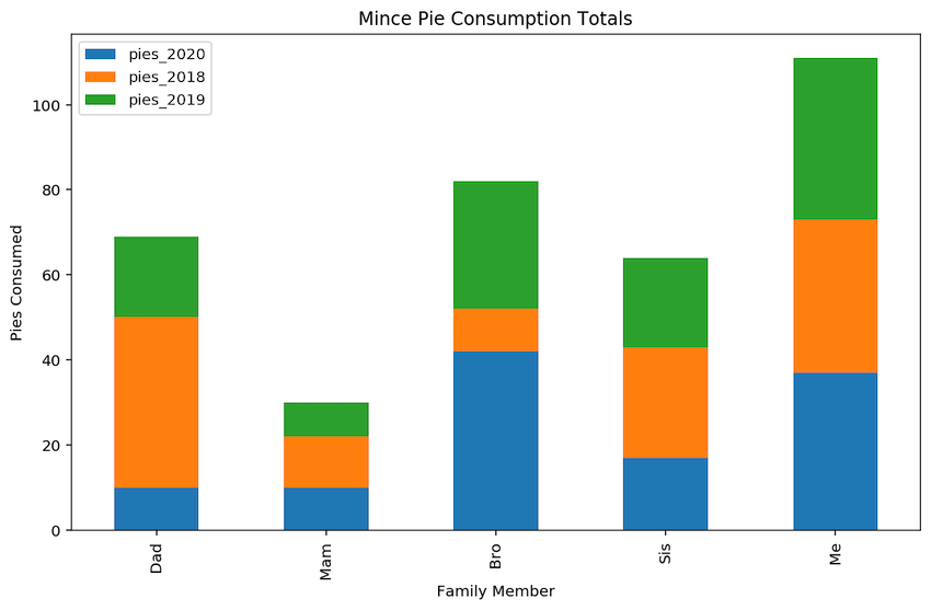
In the stacked bar chart, we’re seeing total number of pies eaten over all years by each person, split by the years in question. It is difficult to quickly see the evolution of values over the samples in a stacked bar chart, but much easier to see the composition of each sample. The choice of chart depends on the story you are telling or point being illustrated.
Wherever possible, make the pattern that you’re drawing attention to in each chart as visually obvious as possible. Stacking bar charts to 100% is one way to show composition in a visually compelling manner.
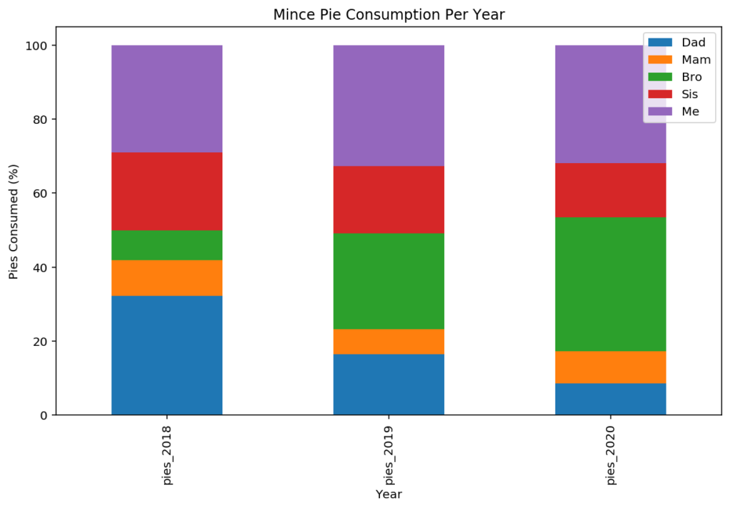
Stacking to 100% (filled-bar chart)
Showing composition of the whole, as a percentage of total is a different type of bar chart, but useful for comparing the proportional makeups of different samples on your x-axis.
A “100% stacked” bar is not supported out of the box by Pandas (there is no “stack-to-full” parameter, yet!), requiring knowledge from a previous blog post on “grouping and aggregation” functionality in Pandas.
Start with our test dataset again:
plotdata = pd.DataFrame({
    "pies_2018":[40, 12, 10, 26, 36],
    "pies_2019":[19, 8, 30, 21, 38],
    "pies_2020":[10, 10, 42, 17, 37]
    }, index=["Dad", "Mam", "Bro", "Sis", "Me"]
)
plotdata.head()
We can convert each row into “percentage of total” measurements relatively easily with the Pandas apply function, before going back to the plot command:
stacked_data = plotdata.apply(lambda x: x*100/sum(x), axis=1)
stacked_data.plot(kind="bar", stacked=True)
plt.title("Mince Pie Consumption Breakdown")
plt.xlabel("Family Member")
plt.ylabel("Percentage Pies Consumed (%)")
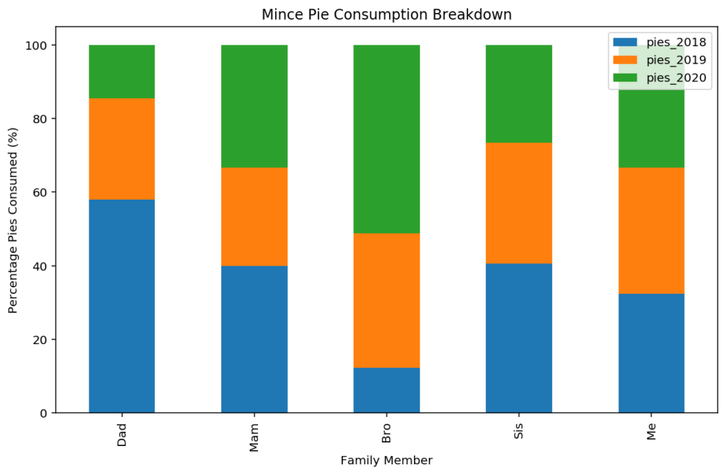
For this same chart type (with person on the x-axis), the stacked to 100% bar chart shows us which years make up different proportions of consumption for each person. For example, we can see that 2018 made up a much higher proportion of total pie consumption for Dad than it did my brother.
Transposing for a different view
It may be more useful to ask the question – which family member ate the highest portion of the pies each year? This question requires a transposing of the data so that “year” becomes our index variable, and “person” become our category.
In this figure, the visualisation tells a different story, where I’m emerging as a long-term glutton with potentially one of the highest portions of total pies each year. (I’ve been found out!)
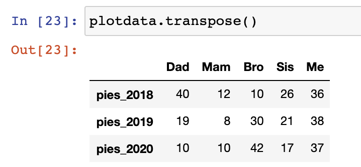
plotdata.transpose().apply(lambda x: x*100/sum(x), axis=1).plot(kind="bar", stacked=True)
plt.title("Mince Pie Consumption Per Year")
plt.xlabel("Year")
plt.ylabel("Pies Consumed (%)")
Choosing the X-axis manually
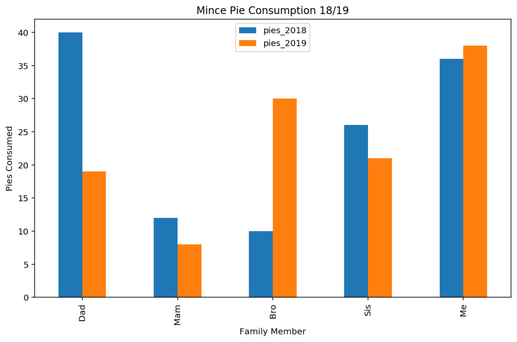
The index is not the only option for the x-axis marks on the plot. Often, the index on your dataframe is not representative of the x-axis values that you’d like to plot. To flexibly choose the x-axis ticks from a column, you can supply the “x” parameter and “y” parameters to the plot function manually.
As an example, we reset the index (.reset_index()) on the existing example, creating a column called “index” with the same values as previously. We can then visualise different columns as required using the x and y parameter values.
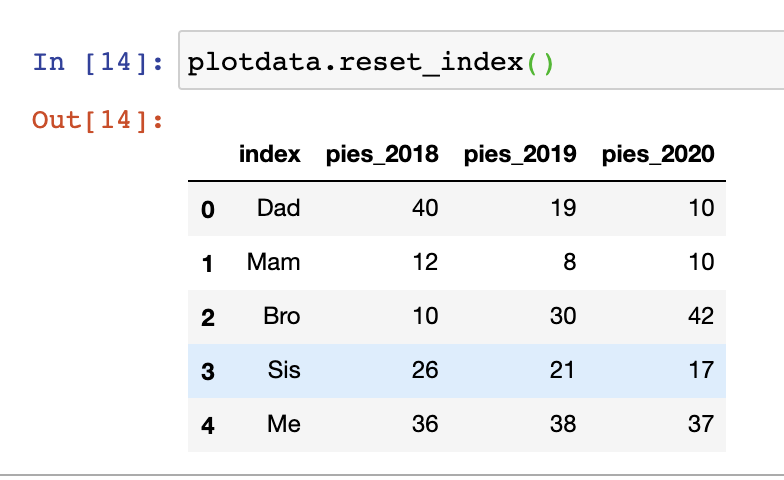
plotdata.reset_index().plot(
    x="index", y=["pies_2018", "pies_2019"], kind="bar"
)
plt.title("Mince Pie Consumption 18/19")
plt.xlabel("Family Member")
plt.ylabel("Pies Consumed")
Colouring bars by a category
The next dimension to play with on bar charts is different categories of bar. Colour variation in bar fill colours is an efficient way to draw attention to differences between samples that share common characteristics. It’s best not to simply colour all bars differently, but colour by common characteristics to allow comparison between groups. As an aside, if you can, keep the total number of colours on your chart to less than 5 for ease of comprehension.
Manually colouring bars
Let’s colour the bars by the gender of the individuals. Unfortunately, this is another area where Pandas default plotting is not as friendly as it could be. Ideally, we could specify a new “gender” column as a “colour-by-this” input. Instead, we have to manually specify the colours of each bar on the plot, either programmatically or manually.
The manual method is only suitable for the simplest of datasets and plots:
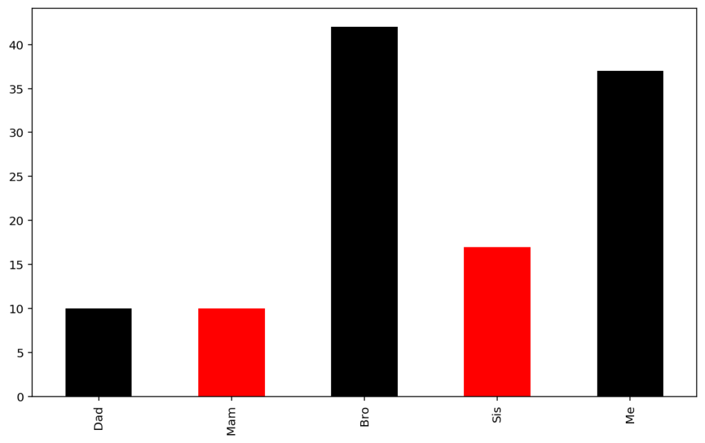
plotdata['pies'].plot(kind="bar", color=['black', 'red', 'black', 'red', 'black'])
Colouring by a column
A more scaleable approach is to specify the colours that you want for each entry of a new “gender” column, and then sample from these colours. Start by adding a column denoting gender (or your “colour-by” column) for each member of the family.
plotdata = pd.DataFrame({
    "pies": [10, 10, 42, 17, 37],
    "gender": ["male", "female", "male", "female", "male"]
    },
    index=["Dad", "Mam", "Bro", "Sis", "Me"]
)
plotdata.head()
Now define a dictionary that maps the gender values to colours, and use the Pandas “replace” function to insert these into the plotting command. Note that colours can be specified as
- words (“red”, “black”, “blue” etc.),
- RGB hex codes (“#0097e6”, “#7f8fa6”), or
- with single-character shortcuts from matplotlib (“k”, “r”, “b”, “y” etc).
I would recommend the Flat UI colours website for inspiration on colour implementations that look great.
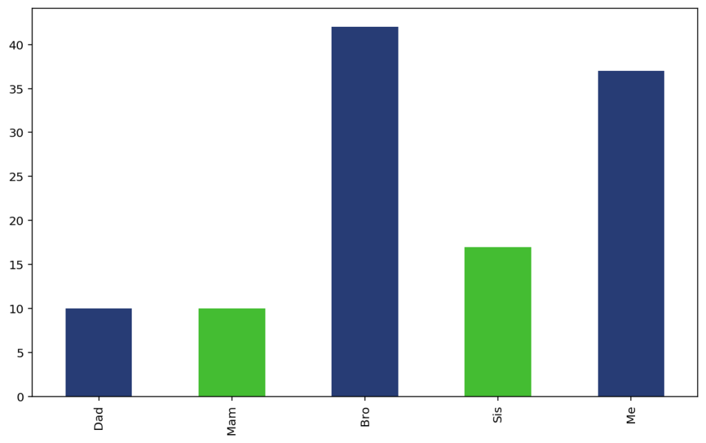
# Define a dictionary mapping variable values to colours:
colours = {"male": "#273c75", "female": "#44bd32"}
plotdata['pies'].plot(
    kind="bar",
    color=plotdata['gender'].replace(colours)
)
Adding a legend for manually coloured bars
Because Pandas plotting isn’t natively supporting the addition of “colour by category”, adding a legend isn’t super simple, and requires some dabbling in the depths of Matplotlib. The colour legend is manually created in this situation, using individual “Patch” objects for the colour displays.
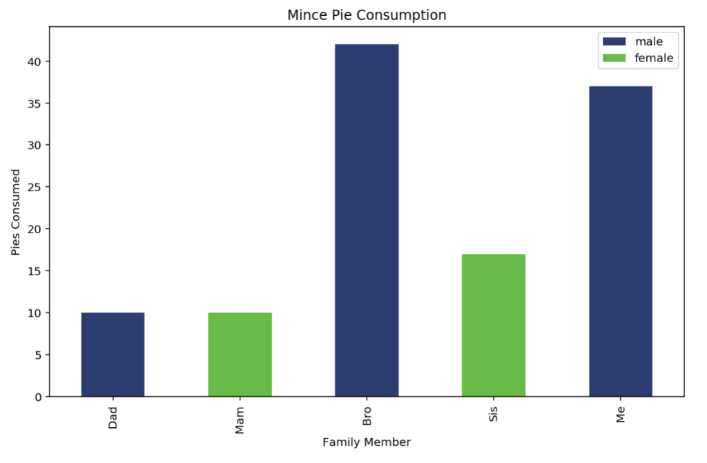
from matplotlib.patches import Patch

colours = {"male": "#273c75", "female": "#44bd32"}
plotdata['pies'].plot(
        kind="bar", color=plotdata['gender'].replace(colours)
).legend(
    [
        Patch(facecolor=colours['male']),
        Patch(facecolor=colours['female'])
    ], ["male", "female"]
)

plt.title("Mince Pie Consumption")
plt.xlabel("Family Member")
plt.ylabel("Pies Consumed")
Styling your Pandas Barcharts
Fine-tuning your plot legend – position and hiding
With multiple series in the DataFrame, a legend is automatically added to the plot to differentiate the colours on the resulting plot. You can disable the legend with a simple legend=False as part of the plot command.
plotdata[["pies_2020", "pies_2018", "pies_2019"]].plot(
    kind="bar", stacked=True, legend=False
)
The legend position and appearance can be achieved by adding the .legend() function to your plotting command. The main controls you’ll need are loc to define the legend location, ncol the number of columns, and title for a name.
See https://matplotlib.org/3.1.1/api/_as_gen/matplotlib.pyplot.legend.html for a full set of parameters. The available legend locations are
- best
- upper right
- upper left
- lower left
- lower right
- right
- center left
- center right
- lower center
- upper center
- center
# Plot and control the legend position, layout, and title with .legend(...)
plotdata[["pies_2020", "pies_2018", "pies_2019"]].plot(
    kind="bar", stacked=True
).legend(
    loc='upper center', ncol=3, title="Year of Eating"
)
plt.title("Mince Pie Consumption Totals")
plt.xlabel("Family Member")
plt.ylabel("Pies Consumed")
Applying themes and styles
The default look and feel for the Matplotlib plots produced with the Pandas library are sometimes not aesthetically amazing for those with an eye for colour or design. There’s a few options to easily add visually pleasing theming to your visualisation output.
Using Matplotlib Themes
Matplotlib comes with options for the “look and feel” of the plots. Themes are customiseable and plentiful; a comprehensive list can be seen here: https://matplotlib.org/3.1.1/gallery/style_sheets/style_sheets_reference.html
Simply choose the theme of choice, and apply with the matplotlib.style.use function.
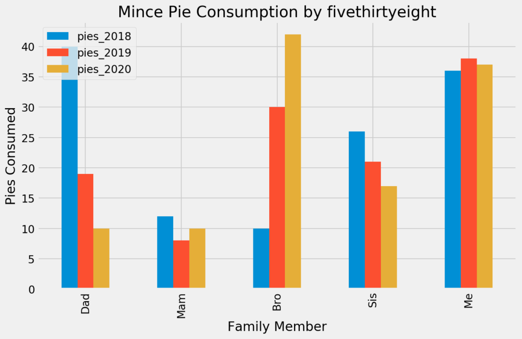
import matplotlib
matplotlib.style.use('fivethirtyeight')
plotdata.plot(kind="bar")

plt.title("Mince Pie Consumption by 538")
plt.xlabel("Family Member")
plt.ylabel("Pies Consumed")
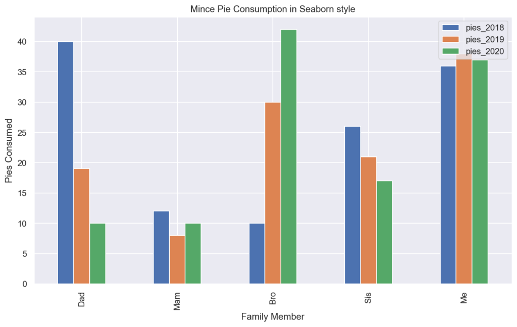
Styling with Seaborn
A second simple option for theming your Pandas charts is to install the Python Seaborn library, a different plotting library for Python. Seaborn comes with five excellent themes that can be applied by default to all of your Pandas plots by simply importing the library and calling the set() or the set_style() functions.
import seaborn as sns
sns.set_style("dark")
plotdata.plot(kind="bar")
plt.title("Mince Pie Consumption in Seaborn style")
plt.xlabel("Family Member")
plt.ylabel("Pies Consumed")
More Reading
By now you hopefully have gained some knowledge on the essence of generating bar charts from Pandas DataFrames, and you’re set to embark on a plotting journey. Make sure you catch up on other posts about loading data from CSV files to get your data from Excel / other, and then ensure you’re up to speed on the various group-by operations provided by Pandas for maximum flexibility in visualisations.
Outside of this post, just get stuck into practicing – it’s the best way to learn. If you are looking for additional reading, it’s worth reviewing:
Great tutorial, this avoids all the tedious parameter selections of matplotlib and with the custom styles (e.g. sns) can give really nice plots. Appreciate the work, will be using this now !
Thanks for the feedback! Yes, I wrote this after MANY MANY hours of switching libraries and trying to get my head around what the best approach is.
thanks for this!
sir How do we give the total number of elements present in the one column on top of the bar graph column
Excellent post, using some of the tips in work. Thank you so much.
many thanks!
I would like to plot the data to stacked bar in PyQt5, any idea or suggestion for the axes setting instead of plt?
so instead of:
plotdata.plot(kind='bar', stacked=True)
plt.title("Total Pie Consumption")
plt.xlabel("Family Member")
plt.ylabel("Pies Consumed")
how to plot it with pyqt5?
could it be like this?
plotdata.plot(kind='bar', stacked=True, ax=self.axes) fig = Figure() self.axes = fig.add_subplot(111) self.axes.title("Total Pie Consumption") self.xlabel("Family Member") self.ylabel("Pies Consumed")May I know how to give different hatches to different bars within a group in grouped bar chart or stacks in a stacked bar chart .Thank you.
how do we increase the size of the stacked graph?
How can we get data labels on the plot? getting the actual values on the bars
kuch aur batao
Great tutorial – one question – how do you save your plot to a file at the end?
How to make the first plot which is shown at the beginning of the article.
Some bars in the chart are not shown since the range of values in y axis for the bar is too low and loo high .How to handle such cases and display even the smallest bar along with the tallest bars