The ability to explore and grasp data structures through quick and intuitive visualisation is a key skill of any data scientist. Different tools in the Python ecosystem required varying levels of mental-gymnastics to manipulate and visualise information during a data exploration session.
The array of Python libraries, each with their own idiosyncrasies, available can be daunting for newcomers and data scientists-in-training. In this talk, we will examine the core data visualisation libraries compatible with the popular Pandas data wrangling library. We’ll look at the base-level Matplotlib library first, and then show the benefits of the higher-level Pandas visualisation toolkit, the popular Seaborn visualisation library, and the Vega-lite based Altair.
This talk was presented at Pycon Ireland 2018, and the aim was to introduce attendee to different libraries for bar plotting, scatter plotting, and line plotting (never pie charting) their way to data visualisation bliss.
Presentation Slides
This presentation has been uploaded to SpeakerDeck for those interested in a downloadable format.
Presentation Contents:
- Introduction to Data Visualisation.
- Basic Python Setup for Data Visualisation
- Main chart types – Barplot, Histogram, Scatter Plot, Line Chart.
- Core libraries and Python visualisation toolsets.
- Bar Plot and Stacked Bar plot in Matplotlib, Pandas, Seaborn, Altair.
- Histograms and Stacked Bar plot in Matplotlib, Pandas, Seaborn, Altair.
- Scatter Plots and Stacked Bar plot in Matplotlib, Pandas, Seaborn, Altair.
- Line Plots and Stacked Bar plot in Matplotlib, Pandas, Seaborn, Altair.
- Other Data visualisation options – Plotly and Bokeh.
- Data Visualisation mistakes – what to watch out for.
- Conclusions
PyCon IE Video
Unfortunately (who can bear the sound of their own voice!), there’s a video of the proceedings of the day, where these slides were presented at the Radisson in Dublin in November 2018.
Hi. I just to run my data in GEPAS, which is not publically available anymore. Please advise the website to run my data in something similar-R?. Can I just upload my data and the program give me the results, as GEPAS? Thanks
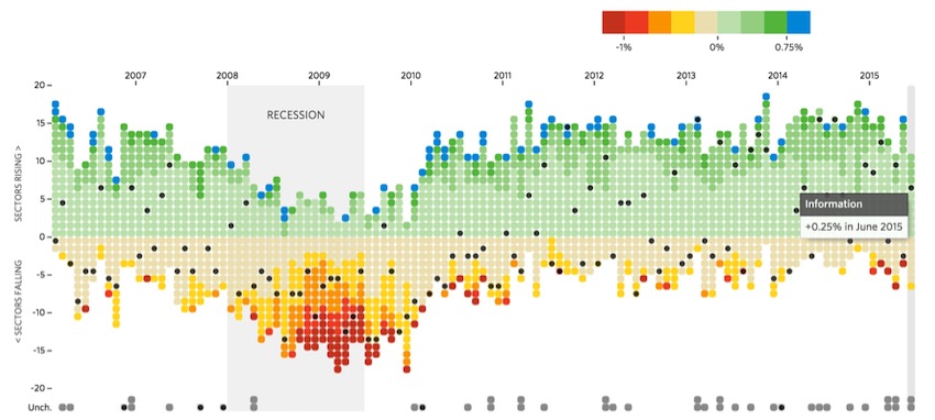
The chart at the top of your article is beautiful! With what visualization package was it accomplished?