Anyone familiar with the use of Python for data science and analysis projects has googled some combination of “plotting in python”, “data visualisation in python”, “barcharts in python” at some point. It’s not uncommon to end up lost in a sea of competing libraries, confused and alone, and just to go home again!
The purpose of this post is to help navigate the options for bar-plotting, line-plotting, scatter-plotting, and maybe pie-charting through an examination of five Python visualisation libraries, with an example plot created in each.
For data scientists coming from R, this is a new pain. R has one primary, well-used, and well-documented library for plotting: ggplot2, a package that provides a uniform API for all plot types. Unfortunately the Python port of ggplot2 isn’t as complete, and may lead to additional frustration.
Getting Set Up for Visualisation in Python
How to choose a visualisation tool
Data visualisation describes any effort to help people understand the significance of data by placing it in a visual context.
Data visualisation describes the movement from raw data to meaningful insights and learning, and is an invaluable skill (when used correctly) for uncovering correlations, patterns, movements, and achieving comparisons of data.
The choice of data visualisation tool is a particularly important decision for analysts involved in dissecting or modelling data. Ultimately, your choice of tool should lead to:
- Fast iteration speed: the ability to quickly iterate on different visualisations to find the answers you’re searching for or validate throwaway ideas.
- Un-instrusive operation: If every plot requires a Google search, it’s easy to lose focus on the task at hand: visualising. Your tool of choice should be simple to use, un-instrusive, and not the focus of your work and effort.
- Flexibility: The tool(s) chosen should allow you to create all of the basic chart types easily. The basic toolset should include at least bar-charts, histograms, scatter plots, and line charts, with common variants of each.
- Good aesthetics: If your visualisations don’t look good, no one will love them. If you need to change tool to make your charts “presentation ready”, you may need a different tool, and save the effort.
In my experience of Python, to reach a point where you can comfortably explore data in an ad-hoc manner and produce plots in a throwaway fashion, you will most likely need to familiarise yourself with at least two libraries.
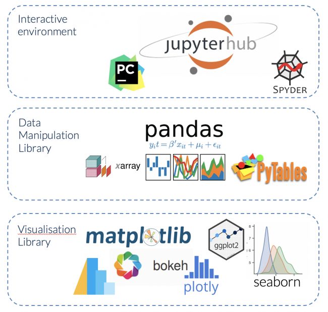
Python visualisation setup
To start creating basic visualisations in Python, you will need a suitable system and environment setup, comprising:
- An interactive environment: A console to execute ad-hoc Python code, and an editor to run scripts. PyCharm, Jupyter notebooks, and the Spyder editor are all great choices, though Jupyter is potentially most popular here.
- A data manipulation library: Extending Python’s basic functionality and data types to quickly manipulate data requires a library – the most popular here is Pandas.
- A visualisation library: – we’ll go through the options now, but ultimately you’ll need to be familiar with more than one to achieve everything you’d like.
Example Plotting Data
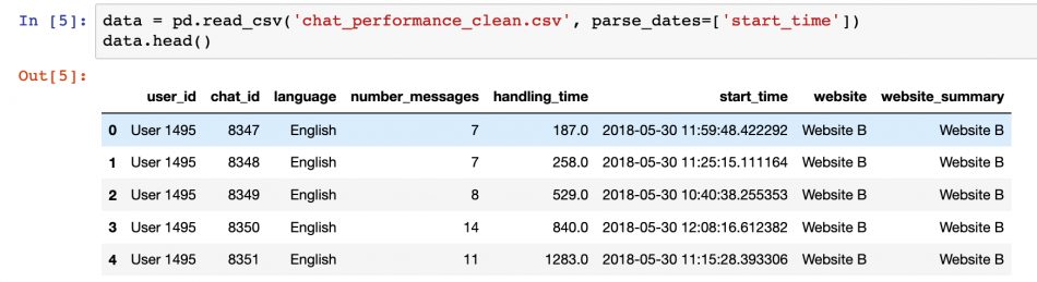
For the purposes of this blog post, a sample data set from an “EdgeTier“-like customer service system is being used. This data contains the summary details of customer service chat interactions between agents and customers, completely anonymised with some spurious data.
The data is provided as a CSV file and loaded into Python Pandas, where each row details an individual chat session, and there are 8 columns with various chat properties, which should be self-explanatory from the column names.
To follow along with these examples, you can download the sample data here.
Bar Plot Example and Data Preparation
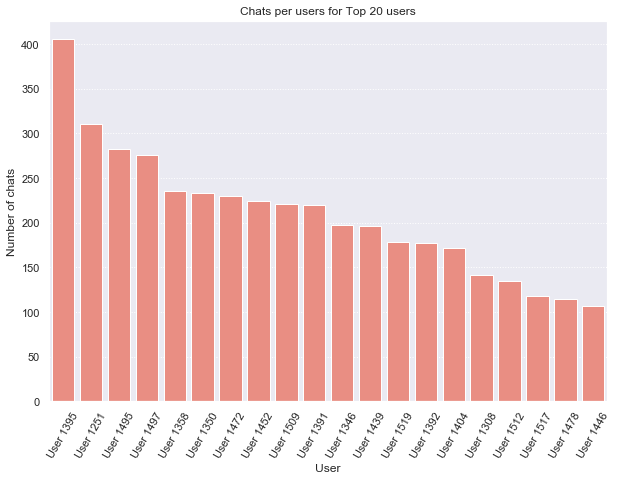
The plot example for this post will be a simple bar plot of the number of chats per user in our dataset for the top 20 users.
For some of the libraries, the data needs to be re-arranged to contain the specific values that you are going to plot (rather than relying on the visualisation library itself to calculate the values). The calculation of “number of chats per user” is easily achieved using the Pandas grouping and summarising functionality:
# Group the data by user_id and round the number of chats that appear for each
chats_per_user = data.groupby(
    'user_id')['chat_id'].count().reset_index()
# Rename the columns in the results
chats_per_user.columns = ['user_id', 'number_chats']
# Sort the results by the number of chats
chats_per_user = chats_per_user.sort_values(
    'number_chats',
    ascending=False
)
# Preview the results
chats_per_user.head()
Matplotlib
Matplotlib is the grand-daddy of Python plotting libraries. Initially launched in 2003, Matplotlib is still actively developed and maintained with over 28,000 commits on the official Matplotlib Github repository from 750+ contributors, and is the most flexible and complete data visualisation library out there.
Matplotlib provides a low-level plotting API, with a MATLAB style interface and output theme. The documentation includes great examples on how best to shape your data and form different chart types. While providing flexibility, the low-level API can lead to verbose visualisation code, and the end results tend to be aesthetically lacking in the absence of significant customisation efforts.
Many of the higher-level visualisation libaries availalbe are based on Matplotlib, so learning enough basic Matplotlib syntax to debug issues is a good idea.
There’s some generic boilerplate imports that are typically used to set up Matplotlib in a Jupyter notebook:
# Matplotlib pyplot provides plotting API
import matplotlib as mpl
from matplotlib import pyplot as plt
# For output plots inline in notebook:
%matplotlib inline
# For interactive plot controls on MatplotLib output:
# %matplotlib notebook

# Set the default figure size for all inline plots
# (note: needs to be AFTER the %matplotlib magic)
plt.rcParams['figure.figsize'] = [8, 5]
Once the data has been rearranged as in the output in “chats_per_user” above, plotting in Matplotlib is simple:
# Show the top 20 users in a bar plot with Matplotlib.
top_n = 20
# Create the bars on the plot
plt.bar(x=range(top_n), # start off with the xticks as numbers 0:19
        height=chats_per_user[0:top_n]['number_chats'])
# Change the xticks to the correct user ids
plt.xticks(range(top_n), chats_per_user[0:top_n]['user_id'],
           rotation=60)
# Set up the x, y labels, titles, and linestyles etc.
plt.ylabel("Number of chats")
plt.xlabel("User")
plt.title("Chats per users for Top 20 users")
plt.gca().yaxis.grid(linestyle=':')
Note that the .bar() function is used to create bar plots, the location of the bars are provided as argument “x”, and the height of the bars as the “height” argument. The axis labels are set after the plot render using the xticks function. The bar could have been made horizontal using the barh function, which is similar, but uses “y” and “width”.
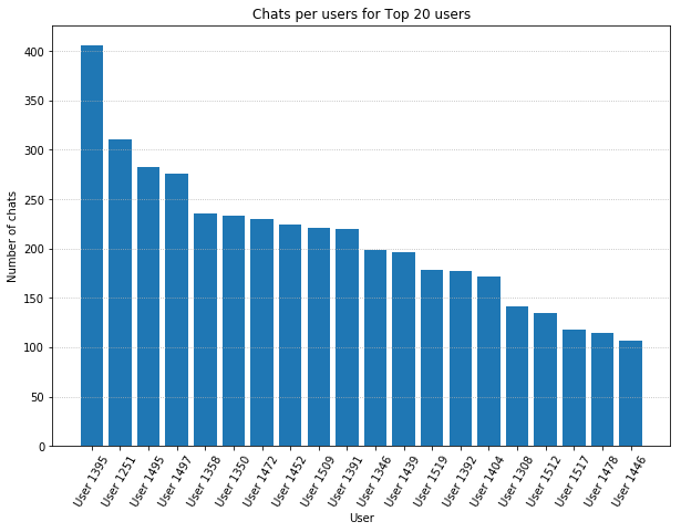
Use of this pattern of plot creation first, followed by various pyplot commands (typically imported as “plt”) is common for Matplotlib generated figures, and for other high-level libraries that use matplotlib as a core. The Matplotlib documentation contains a comprehensive tutorial on the range of plot customisations possible with pyplot.
The advantage of Matplotlib’s flexibility and low-level API can become a disadvantage with more advanced plots requiring very verbose code. For example, there is no simple way to create a stacked bar chart (which is a relatively common display format), and the resulting code is very complicated and untenable as a “quick analysis tool”.
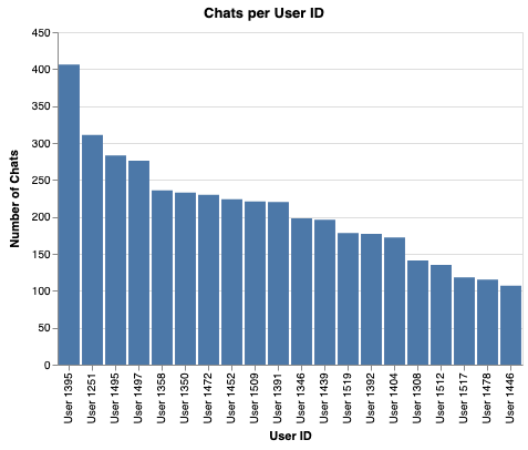
Plotting with Pandas
The Pandas data management library includes simplified wrappers for the Matplotlib API that work seamlessly with the DataFrame and Series data containers. The DataFrame.plot() function provides an API for all of the major chart types, in a simple and concise set of parameters.
Because the outputs are equivalent to more verbose Matplotlib commands, the results can still be lacking visually, but the ability to quickly generate throwaway plots while exploring a dataset makes these methods incredibly useful.
For Pandas visualisation, we operate on the DataFrame object directly to be visualised, following up with Matplotlib-style formatting commands afterwards to add visual details to the plot.
# Plotting directly from DataFrames with Pandas
chats_per_user[0:20].plot(
    x='user_id',
    y='number_chats',
    kind='bar',
    legend=False,
    color='blue',
    width=0.8
)
# The plot is now created, and we use Matplotlib style
# commands to enhance the output.
plt.ylabel("Number of chats")
plt.xlabel("User")
plt.title("Chats per users for Top 20 users")
plt.gca().yaxis.grid(linestyle=':')
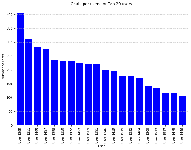
The plotting interface in Pandas is simple, clear, and concise; for bar plots, simply supply the column name for the x and y axes, and the “kind” of chart you want, here a “bar”.
Plotting with Seaborn
Seaborn is a Matplotlib-based visualisation library provides a non-Pandas-based high-level API to create all of the major chart types.
Seaborn outputs are beautiful, with themes reminiscent of the ggplot2 library in R. Seaborn is excellent for the more “statistically inclined” data visualisation practitioner, with built-in functions for density estimators, confidence bounds, and regression functions.
# Creating a bar plot with seaborn
import seaborn as sns
sns.set()

sns.barplot(
    x='user_id',
    y='number_chats',
    color='salmon',
    data=chats_per_user[0:20]
)
# Again, Matplotlib style formatting commands are used
# to customise the output details.
plt.xticks(rotation=60)
plt.ylabel("Number of chats")
plt.xlabel("User")
plt.title("Chats per users for Top 20 users")
plt.gca().yaxis.grid(linestyle=':')
The Seaborn API is a little different to that of Pandas, but worth knowing if you would like to quickly produce publishable charts. As with any library that creates Matplotlib-based output, the basic commands for changing axis titles, fonts, chart sizes, tick marks and other output details are based on Matplotlib commands.
Data Manipulation within Seaborn Plots
The Seaborn library is different from Matplotlib in that manipulation of data can be achieved during the plotting operation, allowing application directly on the raw data (in the above examples, the “chats_per_user” had to be calculated before use with Pandas and Matplotlib).
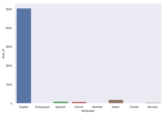
An example of a raw data operation can be seen below, where the count of chats per language is calculated and visualised in a single operation starting with the raw data:
# Calculate and plot in one command with Seaborn
sns.barplot(      # The plot type is specified with the function
    x='language', # Specify x and y axis column names
    y='chat_id',
    estimator=len,# The "estimator" is the function applied to
                  # each grouping of "x"
    data=data     # The dataset here is the raw data with all chats.
)
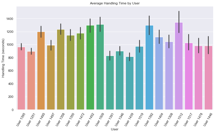
Other estimators can be used to get different statistical measures to visualise within each categorical bin. For another example, consider calculating and plotting the average handling time per user:
# Calculate and plot mean handling time per user from raw data.
sns.barplot(
    x='user_id', y='handling_time',
    estimator=np.mean,  # "mean" function from numpy as estimator
    data=data,          # Raw dataset fed directly to Seaborn
    order=data['user_id'].value_counts().index.tolist()[0:20]
)
# Matplotlib style commands to customise the chart
plt.xlabel('User')
plt.ylabel('Handling Time (seconds)')
plt.title('Average Handling Time by User')
plt.xticks(rotation=60)
Free Styling with Seaborn
For nicer visuals without learning a new API, it is possible to preload the Seaborn library, apply the Seaborn themes, and then plot as usual with Pandas or Matplotlib, but benefit from the improved Seaborn colours and setup.
Using sns.set() set’s the Seaborn theme to all Matplotlib output:
# Getting Seaborn Style for Pandas Plots!
import seaborn
sns.set()         # This command sets the "seaborn" style
chats_per_user[0:20].plot(  # This is Pandas-style plotting
    x='user_id',
    y='number_chats',
    kind='bar',
    legend=False,
    width=0.8
)
# Matplotlib styling of the output:
plt.ylabel("Number of chats")
plt.xlabel("User")
plt.title("Chats per users for Top 20 users")
plt.gca().yaxis.grid(linestyle=':')
For further information on the graph types and capabilities of Seaborn, the walk-through tutorial on the official docs is worth exploring.
Seaborn Stubborness
A final note on Seaborn is that it’s an opinionated library. One particular example is the stacked-bar chart, which Seaborn does not support. The lack of support is not due to any technical difficulty, but rather, the author of the library doesn’t like the chart type.
It’s worth keeping this limitation in mind as you explore which plot types you will need.
Altair
Altair is a “declaritive statistical visualisation” library based on the “vega lite” visualisation grammar.
Altair uses a completely different API to any of the Matplotlib-based libaraies above, and can create interactive visualisations that can be rendered in a browser and stored in JSON format. Outputs look very professional, but there are some caveats to be aware of for complex or data heavy visualisations where entire datasets can end up stored in your notebooks or visualisation files.
The API and commands for Altair are very different to the other libraries we’ve examined:
# Plotting bar charts with Altair
import altair as alt

bars = alt.Chart(
    chats_per_user[0:20],    # Using pre-calculated data in this example
    title='Chats per User ID').mark_bar().encode(
        # Axes are created with alt.X and alt.Y if you need to
        # specify any additional arguments (labels in this case)
        x=alt.X(
            'user_id',
            # Sorting the axis was hard to work out:
            sort=alt.EncodingSortField(field='number_chats',
                                       op='sum',
                                       order='descending'),
            axis=alt.Axis(title='User ID')),
        y=alt.Y(
            'number_chats',
            axis=alt.Axis(title='Number of Chats')
        )
).interactive()
bars
Online Editor for Vega
Altair is unusal in that it actually generates a JSON representation of the plot rendered that can then be rendered again in any Vega-compatible application. For example, the output of the last code block displays natively in a Jupyter notebook, but actually generates the following JSON (which can be pasted into this online Vega editor to render again).
{
  "config": {"view": {"width": 400, "height": 300}},
  "data": {"name": "data-84c58b571b3ed04edf7929613936b11e"},
  "mark": "bar",
  "encoding": {
    "x": {
      "type": "nominal",
      "axis": {"title": "User ID"},
      "field": "user_id",
      "sort": {"op": "sum", "field": "number_chats", "order": "descending"}
    },
    "y": {
      "type": "quantitative",
      "axis": {"title": "Number of Chats"},
      "field": "number_chats"
    }
  },
  "selection": {
    "selector001": {
      "type": "interval",
      "bind": "scales",
      "encodings": ["x", "y"],
      "on": "[mousedown, window:mouseup] > window:mousemove!",
      "translate": "[mousedown, window:mouseup] > window:mousemove!",
      "zoom": "wheel!",
      "mark": {"fill": "#333", "fillOpacity": 0.125, "stroke": "white"},
      "resolve": "global"
    }
  },
  "title": "Chats per User ID",
  "$schema": "https://vega.github.io/schema/vega-lite/v2.6.0.json",
  "datasets": {
    "data-84c58b571b3ed04edf7929613936b11e": [
      {"user_id": "User 1395", "number_chats": 406},
      {"user_id": "User 1251", "number_chats": 311},
      {"user_id": "User 1495", "number_chats": 283},
      {"user_id": "User 1497", "number_chats": 276},
      {"user_id": "User 1358", "number_chats": 236},
      {"user_id": "User 1350", "number_chats": 233},
      {"user_id": "User 1472", "number_chats": 230},
      {"user_id": "User 1452", "number_chats": 224},
      {"user_id": "User 1509", "number_chats": 221},
      {"user_id": "User 1391", "number_chats": 220},
      {"user_id": "User 1346", "number_chats": 198},
      {"user_id": "User 1439", "number_chats": 196},
      {"user_id": "User 1519", "number_chats": 178},
      {"user_id": "User 1392", "number_chats": 177},
      {"user_id": "User 1404", "number_chats": 172},
      {"user_id": "User 1308", "number_chats": 141},
      {"user_id": "User 1512", "number_chats": 135},
      {"user_id": "User 1517", "number_chats": 118},
      {"user_id": "User 1478", "number_chats": 115},
      {"user_id": "User 1446", "number_chats": 107}
    ]
  }
}
Altair Data Aggregations
Similar to Seaborn, the Vega-Lite grammar allows transformations and aggregations to be done during the plot render command. As a result however, all of the raw data is stored with the plot in JSON format, an approach that can lead to very large file sizes if the user is not aware.
# Altair bar plot from raw data.

# to allow plots with > 5000 rows - the following line is needed:
alt.data_transformers.enable('json')

# Charting command starts here:
bars = alt.Chart(
    data,
    title='Chats per User ID').mark_bar().encode(
        x=alt.X(       # Calculations are specified in axes
            'user_id:O',
            sort=alt.EncodingSortField(
                field='count',
                op='sum',
                order='descending'
            )
        ),
        y=alt.Y('count:Q')
).transform_aggregate(    # "transforms" are used to group / aggregate
    count='count()',
    groupby=['user_id']
).transform_window(
    window=[{'op': 'rank', 'as': 'rank'}],
    sort=[{'field': 'count', 'order': 'descending'}]
).transform_filter('datum.rank <= 20')

bars
The flexibility of the Altair system allows you to publish directly to a html page using “chart.save(“test.html”)” and it’s also incredibly easy to quickly allow interaction on the plots in HTML and in Juptyer notebooks for zooming, dragging, and selecting, etc. There is a selection of interactive charts in the online gallery that demonstrate the power of the library.
For an example in the online editor – click here!
Plotly
Plotly is the final plotting library to enter our review. Plotly is an excellent option to create interactive and embeddable visualisations with zoom, hover, and selection capabilities.
Plotly provides a web-service for hosting graphs, and automatically saves your output into an online account, where there is also an excellent editor. However, the library can also be used in offline mode. To use in an offline mode, there are some imports and commands for setup needed usually:
import plotly.graph_objs as go
from plotly.offline import init_notebook_mode, plot, iplot

init_notebook_mode(connected=True)
For plotting, then, the two commands required are:
- plot: to create html output in your working directory
- iplot: to create interactive plots directly in a Jupyter notebook output.
Plotly itself doesn’t provide a direct interface for Pandas DataFrames, so plotting is slightly different to some of the other libraries. To generate our example bar plot, we separately create the chart data and the layout information for the plot with separate Plotly functions:
# Create the data for the bar chart
bar_data = go.Bar(
    x=chats_per_user[0:20]['user_id'],
    y=chats_per_user[0:20]['number_chats']
)
# Create the layout information for display
layout = go.Layout(
    title="Chats per User with Plotly",
    xaxis=dict(title='User ID'),
    yaxis=dict(title='Number of chats')
)
# These two together create the "figure"
figure = go.Figure(data=[bar_data], layout=layout)
# Use "iplot" to create the figure in the Jupyter notebook
iplot(figure)
# use "plot" to create a HTML file for sharing / embedding
plot(figure)
Plotly, with the commands above, creates an interactive chart on the Jupyter notebook cell, which has hover functionality and controls automatically added. The output HTML can be shared and embedded as so, with controls functional (see here).
There are a rich set of visualisation possibilities with the Plotly library, and the addition of intuitive interactive elements opens up a fantastic method to share results and even use the library as a data exploration tool.
Cufflinks – Using Plotly with Pandas directly
The “cufflinks” library is a library that provides bindings between Plotly and Pandas. Cufflinks provides a method to create plots from Pandas DataFrames using the existing Pandas Plot interface but with Plotly output.
After installation with “pip install cufflinks”, the interface for cufflinks offline plotting with Pandas is simple:
import cufflinks as cf
# Going offline means you plot only locally, and dont need a plotly username / password
cf.go_offline()

# Create an interactive bar chart:
chats_per_user[0:20].iplot(
    x='user_id',
    y='number_chats',
    kind='bar'
)
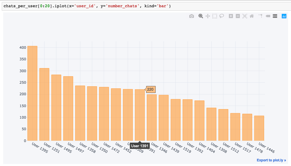
A shareable link allows the chart to be shared and edited online on the Plotly graph creator; for an example, see here. The cufflinks interface supports a wide range of visualisations including bubble charts, bar charts, scatter plots, boxplots, heatmaps, pie charts, maps, and histograms.
“Dash” – The Plotly Web-Application creator
Finally, Plotly also includes a web-application framework to allow users to create interactive web applications for their visualisations. Similar to the Rstudio Shiny package for the R environment, Dash allows filtering, selection, drop-downs, and other UI elements to be added to your visualisation and to change the results in real time.
For inspiration, and to see what’s possible, there’s an excellent gallery of worked Dash examples covering various industries and visualisation types. Dash is commonly compared to Bokeh, another Python visualisation library that has dash-boarding capabilities. Most recently, Plotly have also released the “Dash Design Kit“, which eases the styling for Dash developers.
Overall, the Plotly approach, focussed on interactive plots and online hosting, is different to many other libraries and requires almost a full learning path by itself to master.
Visualisation Library Comparisons
What is the Python Visualisation and Plotting library of your future?
| Library | Pros | Cons |
| Matplotlib | Very flexible Fine grained control over plot elements Forms basis for many other libraries, so learning commands is usefuls | Verbose code to achieve basic plot types. Default output is basic and needs a lot of customisation for publication. |
| Pandas | High level API. Simple interface to learn. Nicely integrated to Pandas data formats. | Plots, by default, are ugly. Limited number of plot types. |
| Seaborn | Better looking styling. Matplotlib based so other knowledge transfers. Somewhat inflexible at times – i.e. no stacked bar charts. Styling can be used by other Matplotlib-based libraries. | Limited in some ways, e.g. no stacked bar charts. |
| Altair | Nice aesthetics on plots. Exports as HTML easily. JSON format and online hosting is useful. Online Vega Editor is useful. | Very different API. Plots actually contain the raw data in the JSON output which can lead to issues with security and file sizes. |
| Plotly | Very simple to add interaction to plots. Flexible and well documented library. Simple integration to Pandas with cufflinks library. “Dash” applications are promising. Only editor and view is useful for sharing and editing. | Very different API again. Somewhat roundabout methods to work offline. Plotly encourages use of cloud platform. |
Overall advice to be proficient and comfortable: Learn the basics of Matplotlib so that you can manipulate graphs after they have been rendered, master the Pandas plotting commands for quick visualisations, and know enough Seaborn to get by when you need something more specialised.
Great post. Excellently set out and easy to follow.
I must try out potly for the interactive features.
[…] for Python users, options for visualisation libraries are plentiful, and Pandas itself has tight integration with the Matplotlib visualisation library, allowing […]