Self-Organising Maps
Self-Organising Maps (SOMs) are an unsupervised data visualisation technique that can be used to visualise high-dimensional data sets in lower (typically 2) dimensional representations. In this post, we examine the use of R to create a SOM for customer segmentation. The figures shown here used use the 2011 Irish Census information for the greater Dublin area as an example data set. This work is based on a talk given to the Dublin R Users group in January 2014.
Note: This post has been updated for changes in the Kohonen API and R 3.2 in 2017.
If you are keen to get down to business:
 The slides from a talk on this subject that I gave to the Dublin R Users group in January 2014 are available here (code is in the slides is *slightly* out of date now)
- The updated code and data for the SOM Dublin Census data is available in this GitHub repository.
- The code for the Dublin Census data example is available for download from here. (zip file containing code and data – filesize 25MB)
SOMs were first described by Teuvo Kohonen in Finland in 1982, and Kohonen’s work in this space has made him the most cited Finnish scientist in the world. Typically, visualisations of SOMs are colourful 2D diagrams of ordered hexagonal nodes.
The SOM Grid
SOM visualisation are made up of multiple “nodes”. Each node vector has:
- A fixed position on the SOM grid
- A weight vector of the same dimension as the input space. (e.g. if your input data represented people, it may have variables “age”, “sex”, “height” and “weight”, each node on the grid will also have values for these variables)
- Associated samples from the input data. Each sample in the input space is “mapped” or “linked” to a node on the map grid. One node can represent several input samples.
The key feature to SOMs is that the topological features of the original input data are preserved on the map. What this means is that similar input samples (where similarity is defined in terms of the input variables (age, sex, height, weight)) are placed close together on the SOM grid. For example, all 55 year old females that are appoximately 1.6m in height will be mapped to nodes in the same area of the grid. Taller and smaller people will be mapped elsewhere, taking all variables into account. Tall heavy males will be closer on the map to tall heavy females than small light males as they are more “similar”.
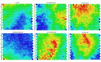
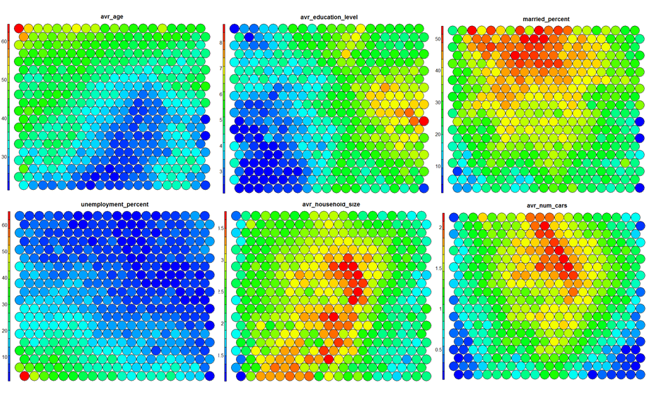
SOM Heatmaps
Typical SOM visualisations are of “heatmaps”. A heatmap shows the distribution of a variable across the SOM. If we imagine our SOM as a room full of people that we are looking down upon, and we were to get each person in the room to hold up a coloured card that represents their age – the result would be a SOM heatmap. People of similar ages would, ideally, be aggregated in the same area. The same can be repeated for age, weight, etc. Visualisation of different heatmaps allows one to explore the relationship between the input variables.
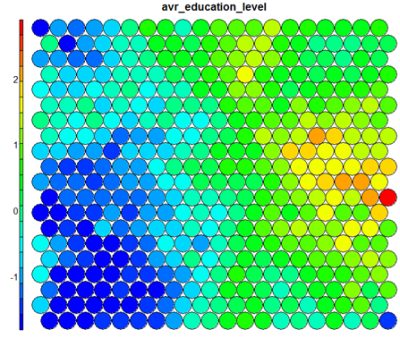
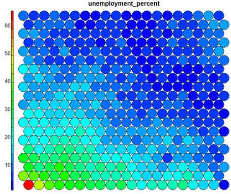
The figure below demonstrates the relationship between average education level and unemployment percentage using two heatmaps. The SOM for these diagrams was generated using areas around Ireland as samples.
SOM Algorithm
The algorithm to produce a SOM from a sample data set can be summarised as follows:
- Select the size and type of the map. The shape can be hexagonal or square, depending on the shape of the nodes your require. Typically, hexagonal grids are preferred since each node then has 6 immediate neighbours.
- Initialise all node weight vectors randomly.
- Choose a random data point from training data and present it to the SOM.
- Find the “Best Matching Unit” (BMU) in the map – the most similar node. Similarity is calculated using the Euclidean distance formula.
- Determine the nodes within the “neighbourhood” of the BMU.
– The size of the neighbourhood decreases with each iteration. - Adjust weights of nodes in the BMU neighbourhood towards the chosen datapoint.
– The learning rate decreases with each iteration.
– The magnitude of the adjustment is proportional to the proximity of the node to the BMU. - Repeat Steps 2-5 for N iterations / convergence.
Sample equations for each of the parameters described here are given on Slideshare.
SOMs in R
Training
The “kohonen” package is a well-documented package in R that facilitates the creation and visualisation of SOMs. To start, you will only require knowledge of a small number of key functions, the general process in R is as follows (see the presentation slides for further details):
# Creating Self-organising maps in R
# Load the kohonen package
require(kohonen)

# Create a training data set (rows are samples, columns are variables
# Here I am selecting a subset of my variables available in "data"
data_train <- data[, c(2,4,5,8)]

# Change the data frame with training data to a matrix
# Also center and scale all variables to give them equal importance during
# the SOM training process.
data_train_matrix <- as.matrix(scale(data_train))

# Create the SOM Grid - you generally have to specify the size of the
# training grid prior to training the SOM. Hexagonal and Circular
# topologies are possible
som_grid <- somgrid(xdim = 20, ydim=20, topo="hexagonal")

# Finally, train the SOM, options for the number of iterations,
# the learning rates, and the neighbourhood are available
som_model <- som(data_train_matrix,
		grid=som_grid,
		rlen=500,
		alpha=c(0.05,0.01),
		keep.data = TRUE )
Visualisation
The kohonen.plot function is used to visualise the quality of your generated SOM and to explore the relationships between the variables in your data set. There are a number different plot types available. Understanding the use of each is key to exploring your SOM and discovering relationships in your data.
- Training Progress:
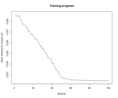
As the SOM training iterations progress, the distance from each node’s weights to the samples represented by that node is reduced. Ideally, this distance should reach a minimum plateau. This plot option shows the progress over time. If the curve is continually decreasing, more iterations are required.#Training progress for SOM plot(som_model, type="changes")

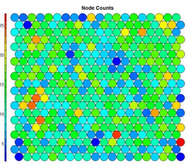
- Node Counts
The Kohonen packages allows us to visualise the count of how many samples are mapped to each node on the map. This metric can be used as a measure of map quality – ideally the sample distribution is relatively uniform. Large values in some map areas suggests that a larger map would be benificial. Empty nodes indicate that your map size is too big for the number of samples. Aim for at least 5-10 samples per node when choosing map size.#Node count plot plot(som_model, type="count", main="Node Counts")

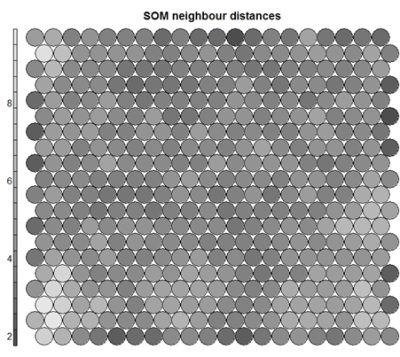
- Neighbour Distance
Often referred to as the “U-Matrix”, this visualisation is of the distance between each node and its neighbours. Typically viewed with a grayscale palette, areas of low neighbour distance indicate groups of nodes that are similar. Areas with large distances indicate the nodes are much more dissimilar – and indicate natural boundaries between node clusters. The U-Matrix can be used to identify clusters within the SOM map.# U-matrix visualisation plot(som_model, type="dist.neighbours", main = "SOM neighbour distances")

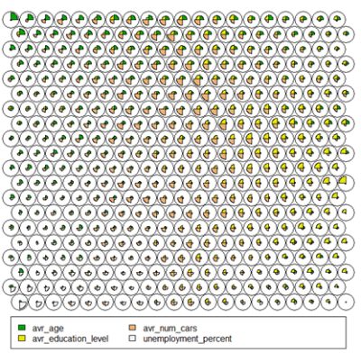
- Codes / Weight vectors
Thenode weight vectors, or “codes”, are made up of normalised values of the original variables used to generate the SOM. Each node’s weight vector is representative / similar of the samples mapped to that node. By visualising the weight vectors across the map, we can see patterns in the distribution of samples and variables. The default visualisation of the weight vectors is a “fan diagram”, where individual fan representations of the magnitude of each variable in the weight vector is shown for each node. Other represenations are available, see the kohonen plot documentation for details.# Weight Vector View plot(som_model, type="codes")

- Heatmaps
Heatmaps are perhaps the most important visualisation possible for Self-Organising Maps. The use of a weight space view as in (4) that tries to view all dimensions on the one diagram is unsuitable for a high-dimensional (>7 variable) SOM. A SOM heatmap allows the visualisation of the distribution of a single variable across the map. Typically, a SOM investigative process involves the creation of multiple heatmaps, and then the comparison of these heatmaps to identify interesting areas on the map. It is important to remember that the individual sample positions do not move from one visualisation to another, the map is simply coloured by different variables.
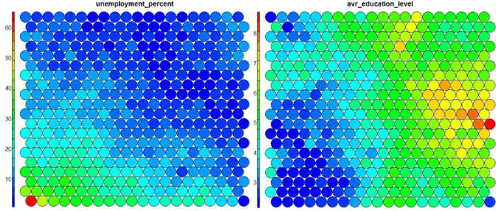
The default Kohonen heatmap is created by using the type “heatmap”, and then providing one of the variables from the set of node weights. In this case we visualise the average education level on the SOM.# Kohonen Heatmap creation plot(som_model, type = "property", property = getCodes(som_model)[,4], main=colnames(getCodes(som_model))[4], palette.name=coolBlueHotRed)

It should be noted that this default visualisation plots the normalised version of the variable of interest. A more intuitive and useful visualisation is of the variable prior to scaling, which involves some R trickery – using the aggregate function to regenerate the variable from the original training set and the SOM node/sample mappings. The result is scaled to the real values of the training variable (in this case, unemployment percent).
# Unscaled Heatmaps
#define the variable to plot
var_unscaled <- aggregate(as.numeric(data_train[,var]), by=list(som_model$unit.classif), FUN=mean, simplify=TRUE)[,2]
plot(som_model, type = "property", property=var_unscaled, main=colnames(getCodes(som_model))[var], palette.name=coolBlueHotRed)
 It is noteworthy that the heatmaps above immediately show an inverse relationship between unemployment percent and education level in the areas around Dublin. Further heatmaps, visualised side by side, can be used to build up a picture of the different areas and their characteristics.
Aside: Heatmaps with empty nodes in your SOM grid
In some cases, your SOM training may result in empty nodes in the SOM map. In this case, you won’t have a way to calculate mean values for these nodes in the “aggregate” line above when working out the unscaled version of the map. With a few additional lines, we can discover what nodes are missing from the som_model$unit.classif and replace these with NA values – this step will prevent empty nodes from distorting your heatmaps.# Plotting unscaled variables when you there are empty nodes in the SOM var_unscaled <- aggregate(as.numeric(data_train_raw[[variable]]), by=list(som_model$unit.classif), FUN=mean, simplify=TRUE) names(var_unscaled) <- c("Node", "Value") # Add in NA values for non-assigned nodes - first find missing nodes: missingNodes <- which(!(seq(1,nrow(som_model$codes)) %in% var_unscaled$Node)) # Add them to the unscaled variable data frame var_unscaled <- rbind(var_unscaled, data.frame(Node=missingNodes, Value=NA)) # order the resulting data frame var_unscaled <- var_unscaled[order(var_unscaled$Node),] # Now create the heat map only using the "Value" which is in the correct order. plot(som_model, type = "property", property=var_unscaled$Value, main=names(data_train)[var], palette.name=coolBlueHotRed)
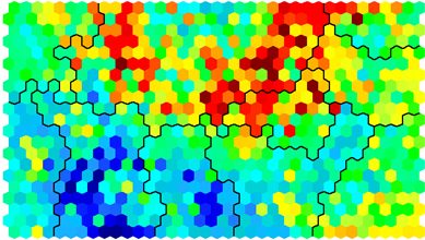
Clustering and Segmentation on top of Self-Organising Map
Clustering can be performed on the SOM nodes to isolate groups of samples with similar metrics. Manual identification of clusters is completed by exploring the heatmaps for a number of variables and drawing up a “story” about the different areas on the map. An estimate of the number of clusters that would be suitable can be ascertained using a kmeans algorithm and examing for an “elbow-point” in the plot of “within cluster sum of squares”. The Kohonen package documentation shows how a map can be clustered using hierachical clustering. The results of the clustering can be visualised using the SOM plot function again.
# Viewing WCSS for kmeans
mydata <- som_model$codes
wss <- (nrow(mydata)-1)*sum(apply(mydata,2,var))
for (i in 2:15) {
  wss[i] <- sum(kmeans(mydata, centers=i)$withinss)
}
plot(wss)
# Visualising cluster results
## use hierarchical clustering to cluster the codebook vectors
som_cluster <- cutree(hclust(dist(som_model$codes)), 6)
# plot these results:
plot(som_model, type="mapping", bgcol = pretty_palette[som_cluster], main = "Clusters")
add.cluster.boundaries(som_model, som_cluster)
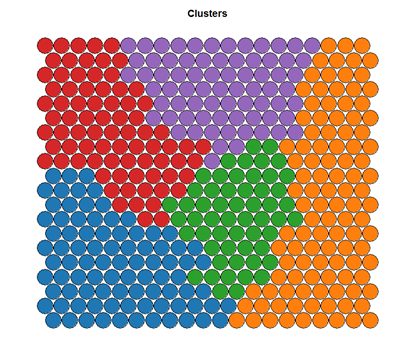
Ideally, the clusters found are contiguous on the map surface. However, this may not be the case, depending on the underlying distribution of variables. To obtain contiguous cluster, a hierachical clustering algorithm can be used that only combines nodes that are similar AND beside each other on the SOM grid. However, hierachical clustering usually suffices and any outlying points can be accounted for manually.
Mapping clusters back to original samples
When a clustering algorithm is applied as per the code example above, clusters are assigned to each of the nodes on the SOM map, rather than the original samples in the dataset. The key to assign labels to the original data is in using the som_cluster variable that maps nodes, with the som_model$unit.classif variable that maps data samples to nodes:
# get vector with cluster value for each original data sample
cluster_assignment <- som_cluster[som_model$unit.classif]
# for each of analysis, add the assignment as a column in the original data:
data$cluster <- cluster_assignment
Use the statistics and distributions of the training variables within each cluster to build a meaningful picture of the cluster characteristics – an activity that is part art, part science! The clustering and visualisation procedure is typically an iterative process. Several SOMs are normally built before a suitable map is created. It is noteworthy that the majority of time used during the SOM development exercise will be in the visualisation of heatmaps and the determination of a good “story” that best explains the data variations.
Conclusions
Self-Organising Maps (SOMs) are another powerful tool to have in your data science repertoire. Advantages include: –
- Intuitive method to develop customer segmentation profiles.
- Relatively simple algorithm, easy to explain results to non-data scientists
- New data points can be mapped to trained model for predictive purposes.
Disadvantages include:
- Lack of parallelisation capabilities for VERY large data sets since the training data set is iterative
- It can be difficult to represent very many variables in two dimensional plane
- SOM training requires clean, numeric data which can be hard to get!
Please do explore the slides and code (2014-01 SOM Example code_release.zip) from the talk for more detail. Contact me if you there are any problems running the example code etc.
Hi Shane, thank you very much for all the material you uploaded here, its been really useful in my research. I know it’s been a while since you made the code but I’ve been looking for the way to show the actual node’s values. On the PDF of the kohonen’s package there isn’t any example where the nodes show the value they are representing. Do you know how can I add this ? It’s part of the ggplot2 package ?
Hi Daniel, Good to hear that the code has been useful in your research. The node values on the diagrams are usually plotted in the sidebar by the Kohonen package. If you want to actually get the node values, have a look at som_model$codes for the real values.
Hi Shane,
Thank you very much for all the material you have uploaded here. It’s been very useful for my reaearch. I know that it’s been while when you developed the code but I haven’t found how on the Heatmap the nodes show their values. On the Kohonen packages there isn’t any example doing it . Could you help me please ?
Hi Shane,
Thanks a million for your reply. I would like to know if there is a way to test new data on a SOM arealdy trained in the kohonen package ?
Hi Shane, I have really enjoyed this article from you. Nice written. In regard to kohonen maps I have used them in a commercial setup in another software. A question that a client is asking me is regarding the heatmap: is there way to know what observations belong a particular node from the heatmap to the observations provided to the model? In the meantime you can see that I have done my homework and I have published a document here http://rpubs.com/darioromero/226110 where I tried a simple case to understand how this work.
Thanks very much for your help.
Hi there, I’ve already asked something similar and I solved it as Shane told me. Look the codebook matrix with som_model$codes and to show on the heatmap of the feature or variable that you are plotting. Then, you call their corresponding column and use text function below the plot function. You have to adjust the coordinates.
Hi Daniel, thanks for your guidance on this topic. In fact, I am using the plot function with the “mapping” feature alone. According to documentation it draws little symbols on a B/W map. I am actually, trying to get a list of coordinates in the SOM like row & column and the observation that falls within that SOM unit. My challenge is how to come back from the SOM unit to the actual observation. I have added a new document showing my progress on this (http://rpubs.com/darioromero/229331). But still a work in progress. Thanks very much!!!
That’a a very good hint and guidance. Thanks very much. I found it. Appreciate it very much!!!
Thank you for the easy to understand posting on using the Kohenen Package in R – Do you know if there is an equivalent set of commands for Kohenen in R to the Matlab SOM Toolbox for projections? (Here are the two SOM Toolbox commands:)
[Pd, v, me] = pcaproj (data,3)
som_grid (map, ‘coord’,pcaproj (map, v,me), ‘marker’, ‘none’, ‘label’, map.labels, ‘labelcolor’, ‘k’)
Carl
Hi carl, apologies for the slow response. But no, I’m not sure on the MATLAB commands for the same!
Hi! Thank you so much for the post, is very interesting.
I have a question about the clustering:
why does de bucle goes to 15?
for (i in 2:15)
Also, how does this determinate the stimate of the number of clusters that would be suitable? how do you see it? by ploting it?
Thank you!!
Hi Romina, no probably. Glad that you found the code interesting. The loop only goes to 15 purely by choice, I reckoned in my dataset I wasn’t going to ever have 15 different clusters. And yes, you can determine the “correct” number of clusters from the plot – where the “elbow” on the plot is is usually best. But remember that there is no “right” or “correct” answer – only one that you can tell a good story from and makes sense from your data.
[…] ecological, and genomic attributes. The inspiration for this came when I stumbled across this blog entry on an approach used in marketing analytics. Imagine that a retailer has a large pool of customers […]
Hi Shane,
That was a very helpful article.I have a question. Is it possible to cluster a map based on the heat map of a variable?
I trained the SOM with all my data with a set of variables (around 200) and then ran the heat map for different variable in the same data set not included in the production map. This gave an interesting heatmap with lots of contiguous areas, My idea is to cluster this map based on the heat, and then use the cluster numbers as a categorical variable( instead of the 200 variables) combined with other variables to build a linear model.
any advice would be very helpful
thank you,
Naren
Hi Narenda, That’s an interesting approach. In a way, you have already clustered the data based on the variables used to train it – just that you have a lot of clusters (the nodes). Clustering based on a single variable after this may not be productive – as there is only one dimension being used to make the new clusters. I would recommend using a clustering algorithm on the actual codes for the segments of the map to come up with larger clusters instead.
[…] Playing with dimensions is a key concept in data science and machine learning. Perplexity parameter is really similar to the k in nearest neighbors algorithm (k-NN). Mapping data into 2-dimension and then do clustering? Hmmm not new buddy: Self-Organising Maps for Customer Segmentation. […]
[…] Playing with dimensions is a key concept in data science and machine learning. Perplexity parameter is really similar to the k in nearest neighbors algorithm (k-NN). Mapping data into 2-dimension and then do clustering? Hmmm not new buddy: Self-Organising Maps for Customer Segmentation. […]
Hi, How did you make it work? I am having the same error.
Hello! How can I display the specific data record/name in the SOM map? Do you know the code for it?
Hello and thank you a lot for an awesome tutorial.
Regarding later use of clusters produced, is this a recommendable big database clustering method or would you recommend using it just for data visualization? If it is how can i test out new values to check which cluster they should be in and how can I plot which variables influence in each specific cluster.
Thank you
Because the SOM algorithm is iterative, its hard to train for big data sets, so I’ve used it primarily as a visualisation technique. To test new values, you will need to normalise them in the same fashion as your training data, and then work out the closest node in the SOM map using a euclidean distance measure. Have a look at the predict() function in the kohonen library too.
Do you know the code already? Thanks
Hey Allen, you need to look in the som_model$unit.classif I think for the assignments of data to each node in the map.
Thank you very much. I have figured it out. My other question is on topographic and quantization error. Do you know the code for these. Thank you for being so helpful.
Hi Shane
Thanks for sharing. Excellent for someone who’s learning the ropes of SOM clustering in R.
I have developed an SOM model on a dataset and developed cluster image using the following codes.
som_model <- som(data_som_scaled, grid = somgrid(15, 15, "hexagonal"), rlen = 500)
pretty_palette <- c("#1f77b4", '#ff7f0e', '#2ca02c', '#d62728', '#9467bd', '#8c564b', '#e377c2')
mypath <- paste("somepath", "clusters", ".png", sep = "")
png(file=mypath, width=2000,height=1200)
som_cluster <- cutree(hclust(dist(som_model$codes)), 6)
plot(som_model, type="mapping", bgcol = pretty_palette[som_cluster], main = "Clusters", cex = 3, font.main= 4)
add.cluster.boundaries(som_model, som_cluster)
dev.off()
Clusters are not contiguous. I want to know how the code can be changed so that contiguous clusters can be formed like yours.
http://techqa.info/programming/question/36501059/how-to-create-contiguous-clusters-in-self-organizing-maps-using-kohonen-package-in-r
Perfect! I’ve been searching the internet high and low for this solution! Thank you 🙂
Hi Gorden, if you ended up writing the code and are open to sharing it, please let me know 🙂
As far as I understand SOM are meant to preserve the topology of the original data set space so the non-contiguous clusters is a consequence of that fundamental assumption. SOM are not like k-means or hierarchical clustering. They actually do change the topology of subjacent data set space. My two cents.
Hello! Anyone here who knows the code for the quantization and topographic error? Thank you.
I just started study about SOM. I have a few questions. How to determine the number of input data and the map size?
How to determine the neighborhood and learning rate?
Hi Suriani – these rates and setups are primarily found through experimentation. You will need to work with your data in an iterative fashion to come up with a set of parameters that work well to suit your story.
Hi Shane, Thanks for sharing the code. I get following error when trying to train the SOM:
Error in supersom(list(X), …) : unused argument (n.hood = “circular”)
Any idea on how to fix it?
Hi Cris – I’ve uploaded some new versions now and created a GitHub repo with some new code for API changes – if you have a chance to look at that and see if the new code works for you, I’d appreciate you input.
Hi Chris – where are you using the supersom() command? That is for supervised SOM training where you have an output variable – this post only works with unsupervised training. Have a look at the xyf() function if you are doing supervised training!
Dear Shane. I deeply appreciate your devotion to SOM using R. Unfortunately, I’m facing same error to CrisK’s, even though I execute som() command, not supersom() command. Currently, there is no description about n.hood in the current version of the kohonen package manual (3.0.2) . I suspect it may result from version issue
Hi Yoon, thanks for the heads up – I’ll have a look at running this code on an updated environment and see if I can replicate the issue and hopefully update the code!
Hi Yoon, I’ve had a go of this now, there were a few changes that might have been causing issues. Can you try with the latest changes, and the GitHub repository and let me know if there are still issues?
Hi Shane,
A wonderful article very well written. I have few questions regarding the working of SOM . Firstly, if i wanted to apply density based clustering algorithm like DBSCAN, should i apply them over som_model$codes? Secondly, I do not understand how an SOM reduces “dimensions” lets say i have 14000 records * 200 dimension dataset. som_model$codes on a 20*20 som_grid reduces this to 400 * 200 dimensions. It is not exactly reducing dimensions here like PCA or T-SNE? am i missing something? thanks
Hi Sundaresh. Yes to the first question – the segmentation is done on the codes for each SOM cluster. For the dimensionality reduction, I think people are referring to the fact that you are viewing the dataset spread across two dimensions – the 20 x 20 grid. The variance and proximity on the new 2D grid represent proximity in the original 200 dimensional dataset – hence the “reduction”.
Hi Sundaresh. Yes to the first question – the segmentation is done on the codes for each SOM cluster. For the dimensionality reduction, I think people are referring to the fact that you are viewing the dataset spread across two dimensions – the 20 x 20 grid. The variance and proximity on the new 2D grid represent proximity in the original 200 dimensional dataset – hence the “reduction”.
Thanks for your reply Shane.. The problem that I am facing is that clustering algos like k means suffer from curse of dimensionality.. What I am trying to achieve is say I have 10,000 records with 300 dimensions.. Can I reduce it to 10,000 * 3 or 10,000 *2 vectors? If I were to implement let’s say k means over som_model$codes, which has 300 dimensions.. Wouldn’t it be a problem?? It still suffers from high dimensionality..I wanted a non linear dimensionality reduction technique and have tried my hands on tsne.. Problem with tsne being the computation time.. It would be helpful if you could guide me.. Thanks
No problem. PCA and T-SNE sounds like you are on the right track. If you would like to try some different bits, have a look at auto-encoder Neural Networks. Though even with t-SNE, its probably not prohibitively long computation times?
Hi Shane,
i’ve found error like this before and till now
Error in readOGR(“./boundary_files/Census2011_Small_Areas_generalised20m.shp”, :
could not find function “readOGR”
can you give me a solution?
Thankyou
Hi Ricko – try adding library(rgdal) to the top of the file. I’ll update the code now too!
Hi Shane,
Thanks for your detailed write up. Is there a simple way to visualize the original data in terms of the som_model$unit.classification.
I also want to extract the input matix vectors based on the clusters they belong to after fitting the som_model