Theming ggplot figure output
The default colour themes in ggplot2 are beautiful. Your figures look great, the colours match, and you have the characteristic “R” look and feel. The author of ggplot2, Hadley Wickham, has done a fantastic job.
For the tinkerers, there’s methods to change every part of the look and feel of your figures. In practice however, changing all of the defaults can feel laborious and too much work when you want a quick change to look and feel.
The ggthemr package was developed by a friend of mine, Ciarán Tobin, who works with me at KillBiller and Edgetier. The package gives a quick and easy way to completely change the look and feel of your ggplot2 figures, as well as quickly create a theme based on your own, or your company’s, colour palette.
In this post, we will quickly examine some of the built in theme variations included with ggplot2 in R, and then look at the colour schemes available using ggthemr.
Basic themes included in ggplot2
There’s 8 built-in theme variations in the latest versions of ggplot2. Quickly change the default look of your figures by adding theme_XX() to the end of your plotting commands.
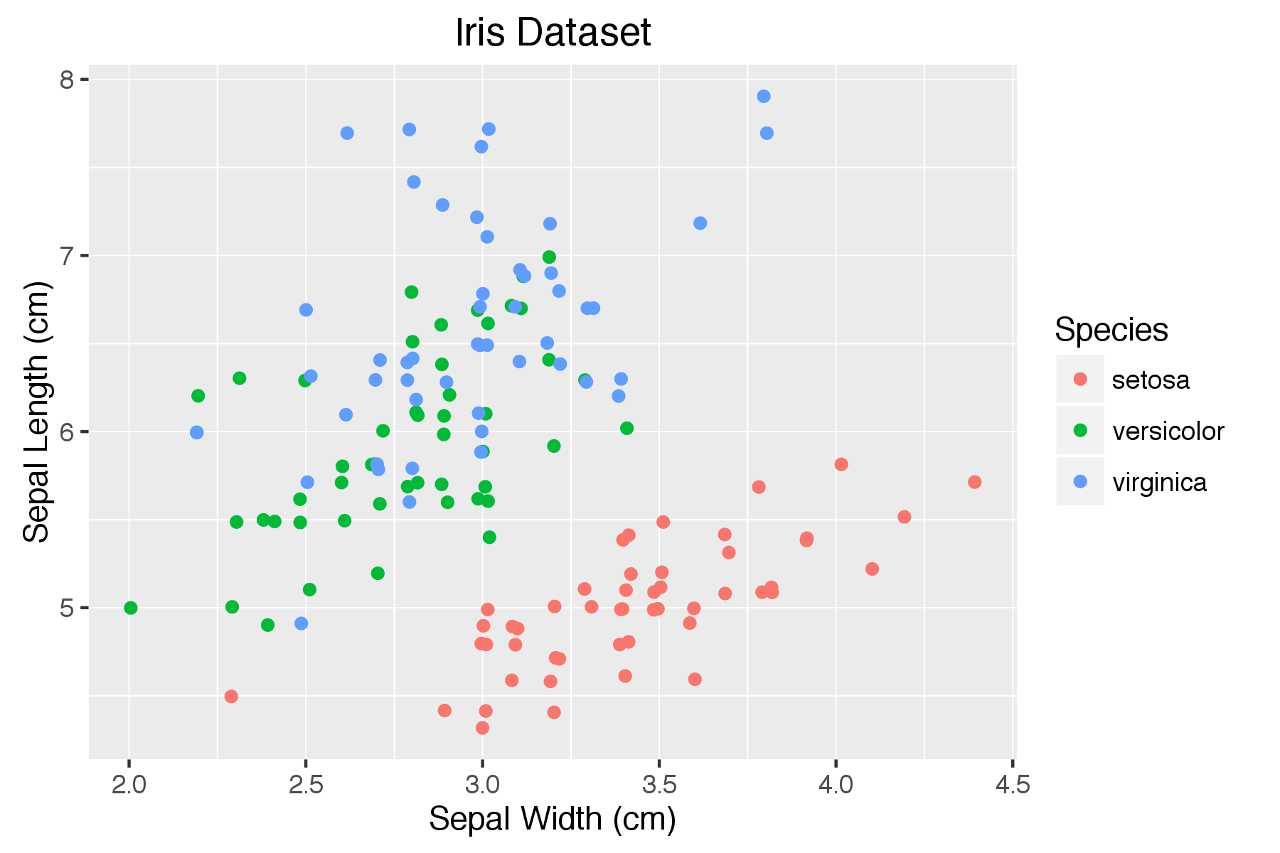
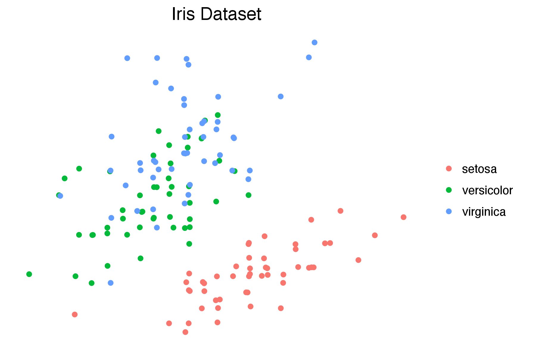
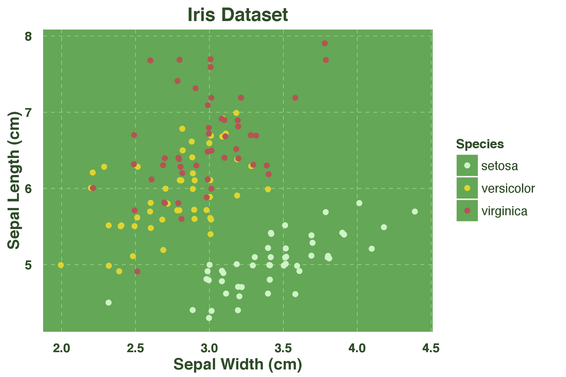
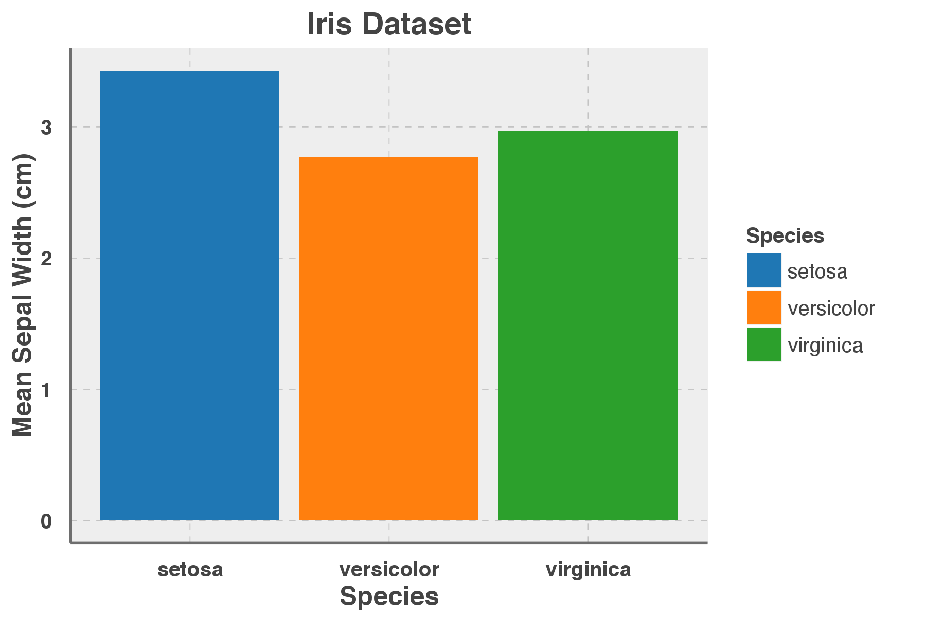
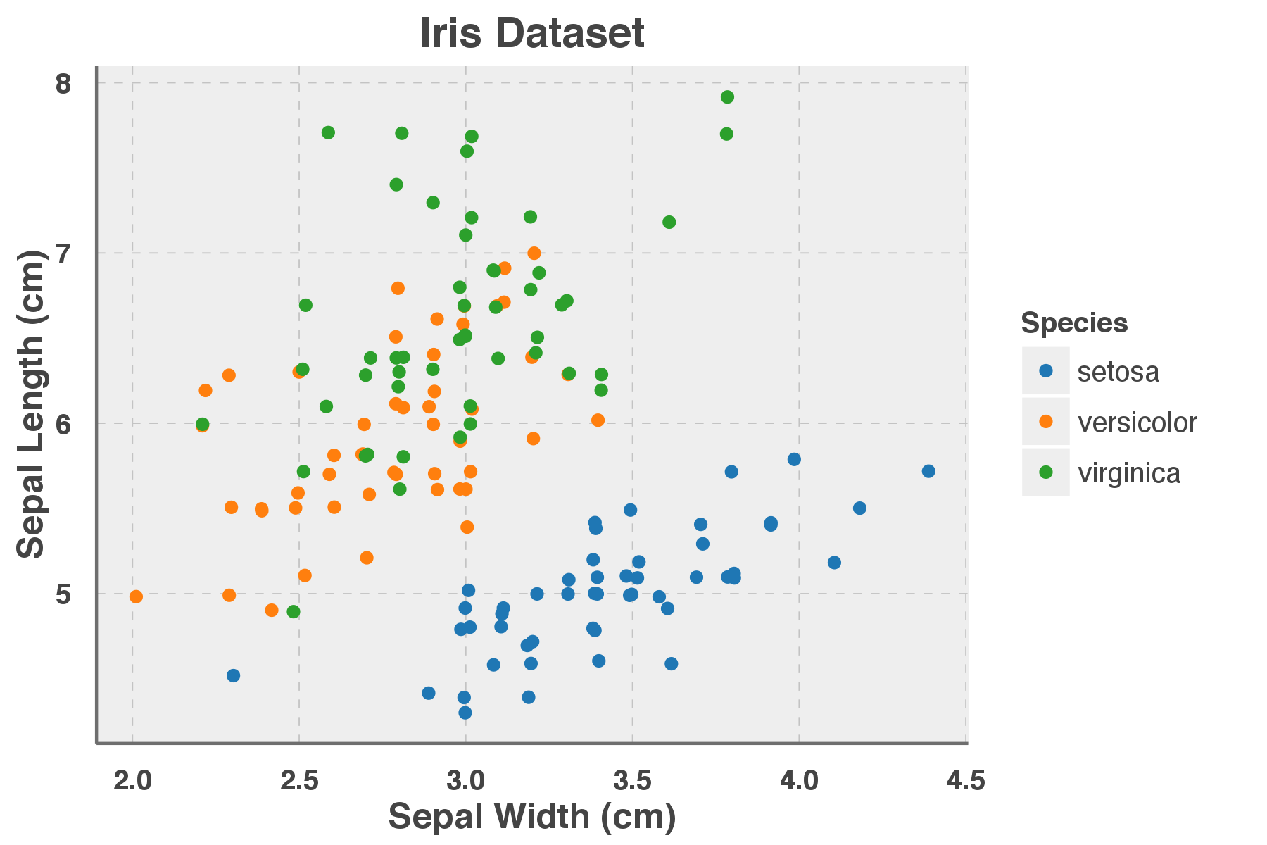
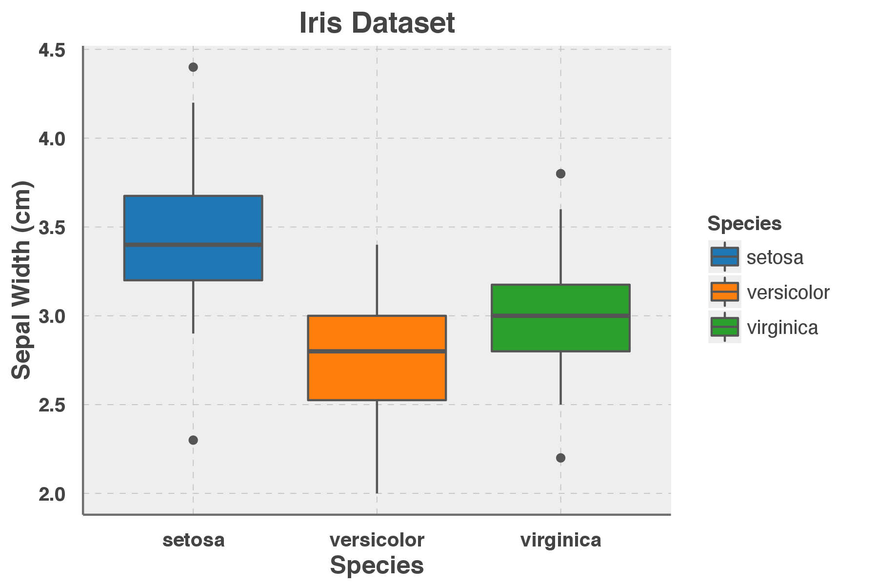
Let’s look at some of these. First create a simple figure, based on the massively overused “iris” dataset, since it’s built-in to R.
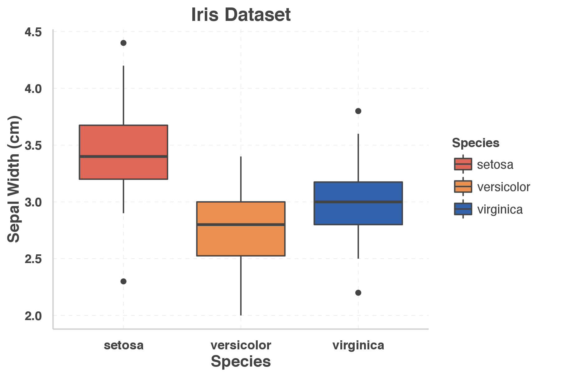
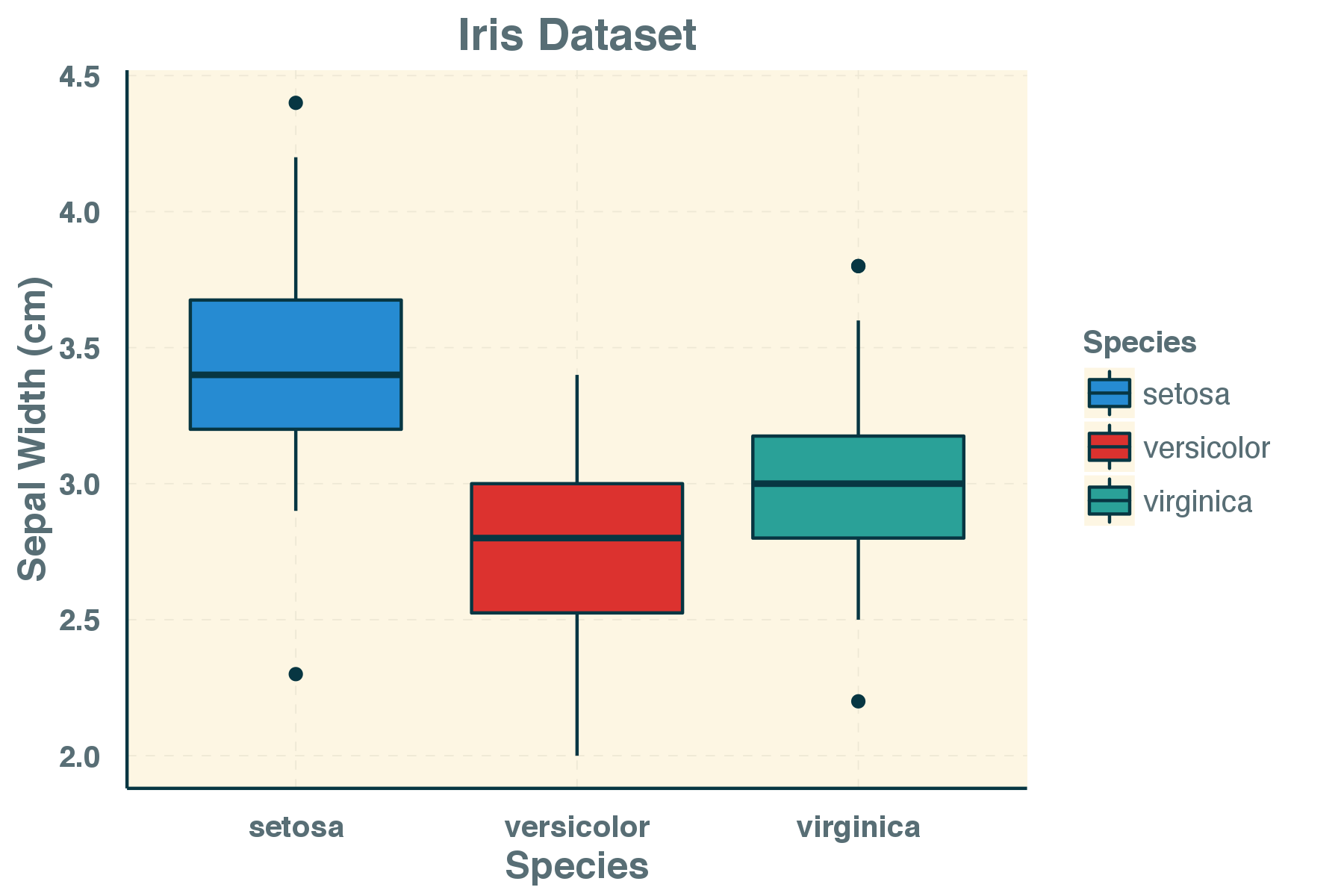
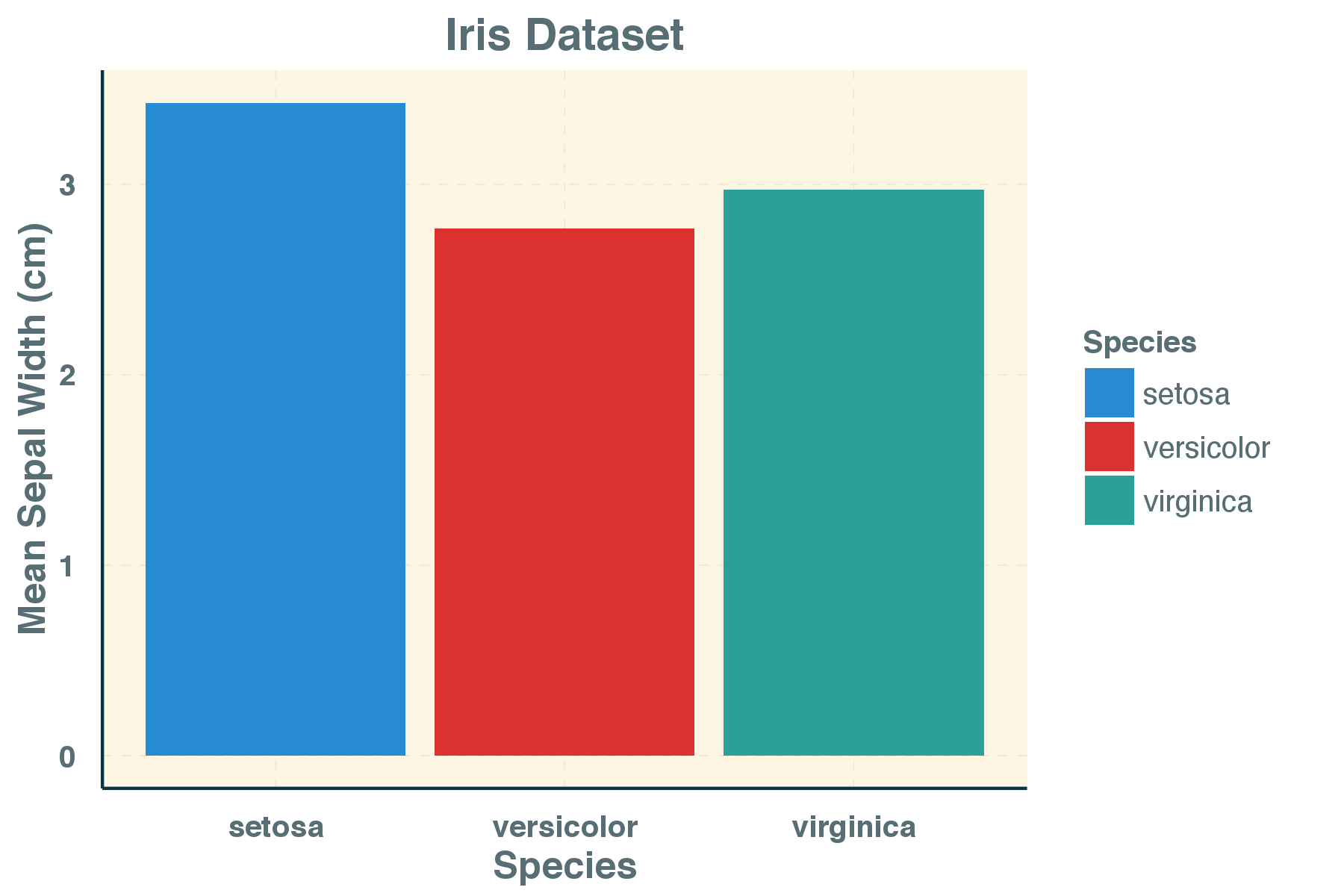
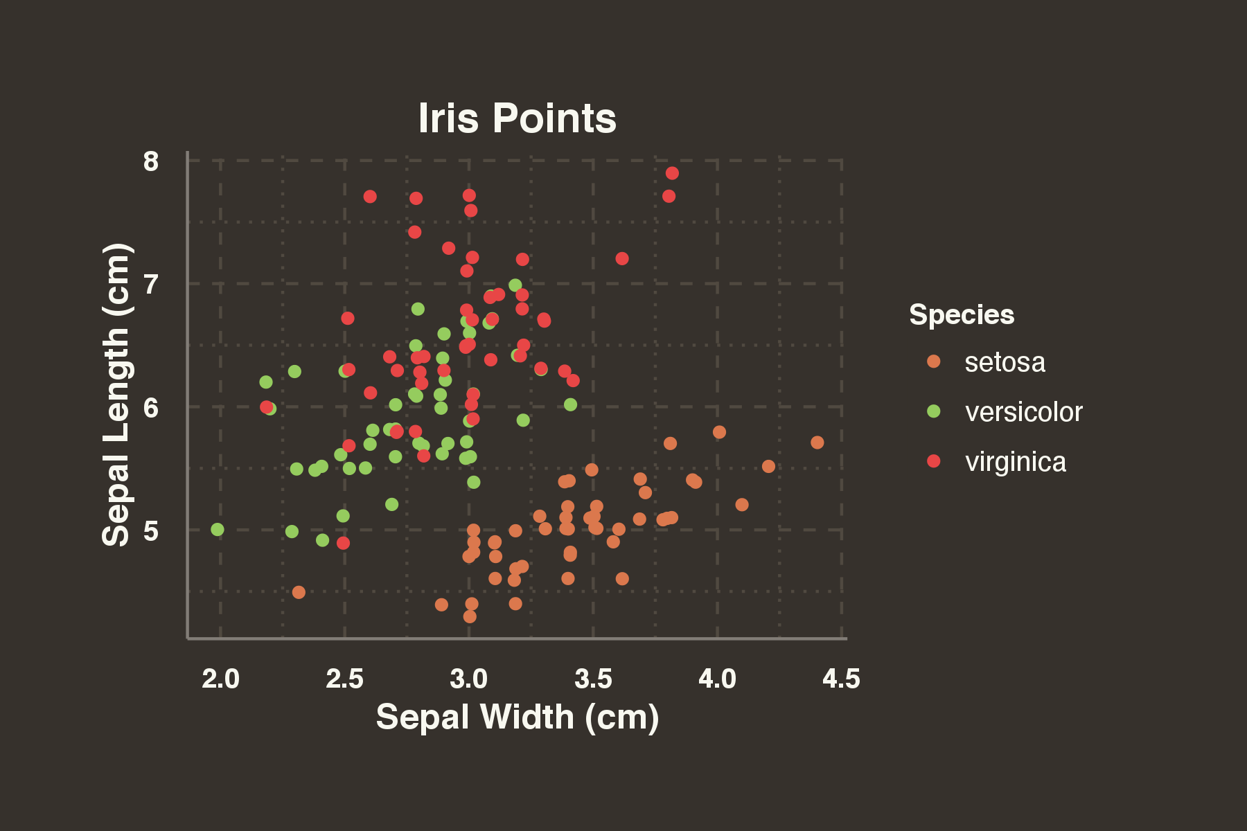
# Define a set of figures to play with using the Iris dataset
point_plot <- ggplot(iris, aes(x=jitter(Sepal.Width), y=jitter(Sepal.Length), col=Species)) +
 geom_point() +
 labs(x="Sepal Width (cm)", y="Sepal Length (cm)", col="Species", title="Iris Dataset")

bar_plot <- ggplot(iris, aes(x=Species, y=Sepal.Width, fill=Species)) +
 geom_bar(stat="summary", fun.y="mean") +
 labs(x="Species", y="Mean Sepal Width (cm)", fill="Species", title="Iris Dataset")

box_plot <- ggplot(iris, aes(x=Species, y=Sepal.Width, fill=Species)) +
 geom_boxplot() +
 labs(x="Species", y="Sepal Width (cm)", fill="Species", title="Iris Dataset")

# Display this figure:
point_plot
# Display this figure with a theme:
point_plot + theme_dark()
The default look and feel can be adjusted by adding an in-build theme from ggplot2.
- theme_gray() – signature ggplot2 theme
- theme_bw() – dark on light ggplot2 theme
- theme_linedraw() – uses black lines on white backgrounds only
- theme_light() – similar to linedraw() but with grey lines aswell
- theme_dark() – lines on a dark background instead of light
- theme_minimal() – no background annotations, minimal feel.
- theme_classic() – theme with no grid lines.
- theme_void() – empty theme with no elements
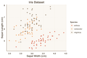
Examples of these theme’s applied to the figure is shown below.
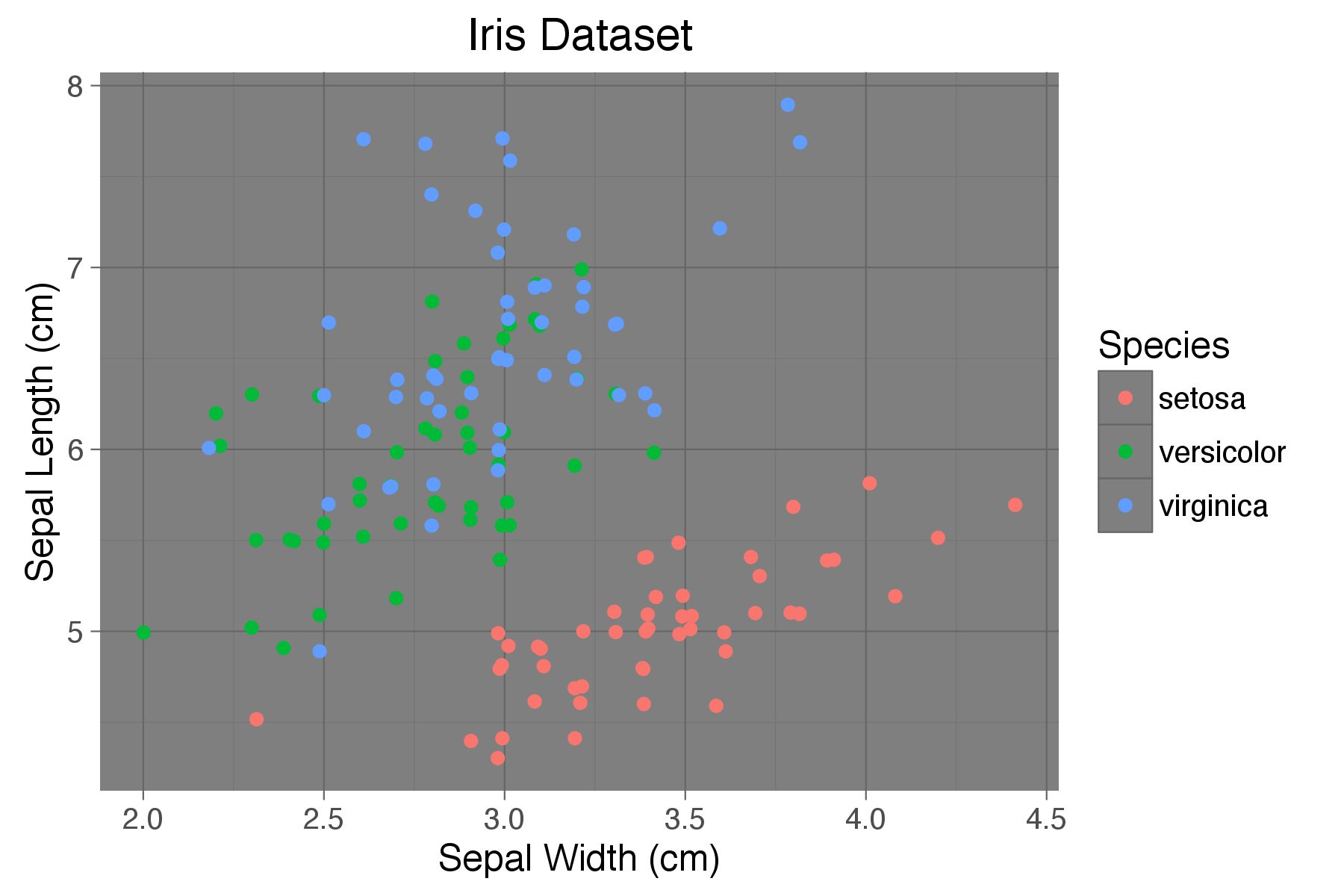
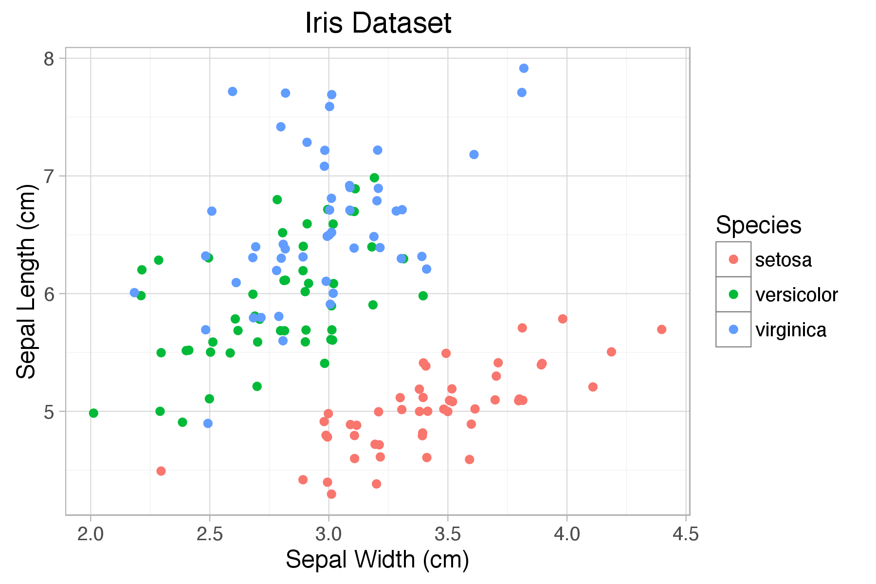
Note that the colour palette for your figures is not affected by these theme changes – only the figure parameters such as the grid lines, outlines, and backgrounds etc.
The “ggthemr” package
The ggthemr R package is an R package to set up a new theme for your ggplot figures, and completely change the look and feel of your figures, from colours to gridlines. The package is available on github, and is installed using the Devtools package:
library(devtools)
devtools::install_github('cttobin/ggthemr')
The ggthemr package is built for “fire-and-forget” usage: you set the theme at the start of your R session, and all of your plots will look different from there.
The command to set a theme is:
# set ggthemr theme
ggthemr("<theme name>")
# plot your existing figure with the new theme
plt
# to remove all ggthemr effects later:
ggthemr_reset()
For example:
library(ggthemr)
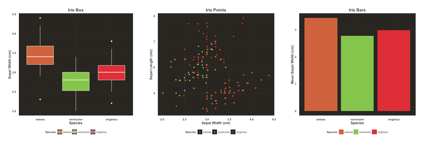
ggthemr("dust")
point_plot
bar_plot

“ggthemr” colour themes
There are 17 built-in colour themes with ggthemr, each one providing a unique way to change your ggplot figure look. All are listed on the ggthemr github page. The colour themes available built-in are:
- flat
- flat-dark
- camoflauge
- chalk
- copper
- dust
- earth
- fresh
- grape
- grass
- greyscale
- light
- lilac
- pale
- sea
- sky
- solarized
One benefit of using ggthemr is that the default color palettes are replaced for lines and bars – completely changing the look of the charts. A complete view of all themes is available here, and some random examples are shown below.


Custom palettes with ggthemr
If you’re in a working environment that has it’s own custom palette, for example a consultancy or accounting firm, it’s great to have ggplot2 figures match your document templates and power point files.
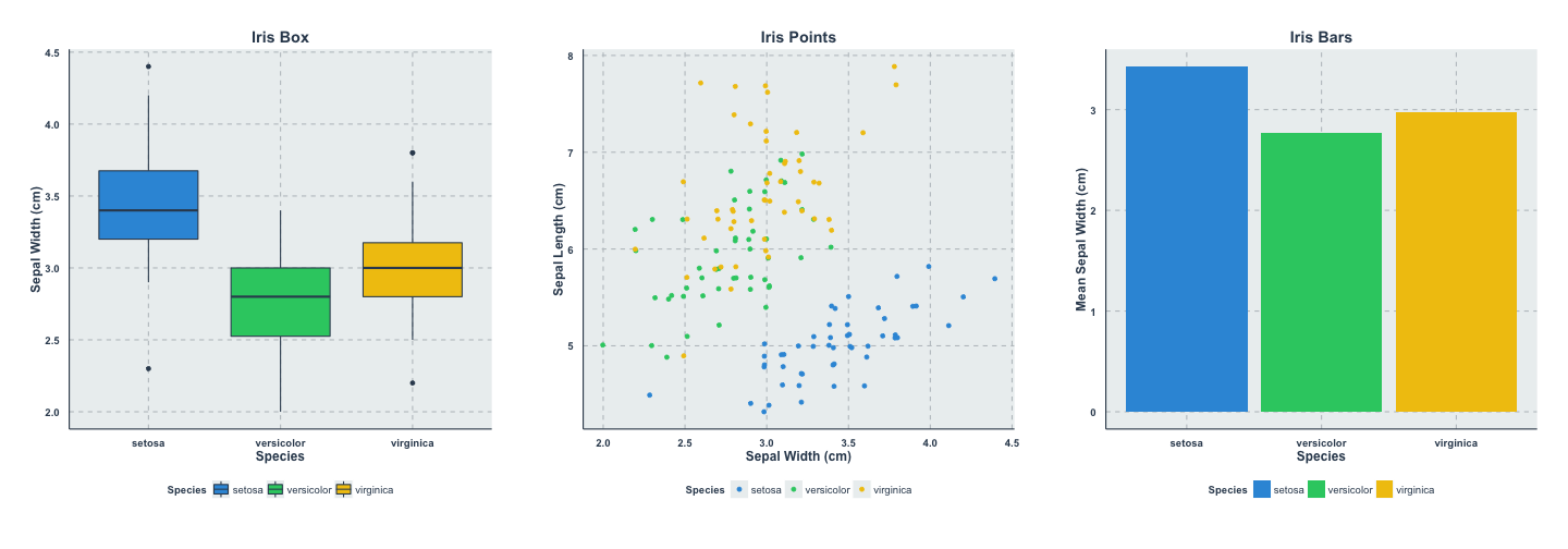
Ggthemr allows you to specify a custom theme palette that can be applied easily. Imagine we worked for “Tableau“, the data visualisation and business intelligence platform.
To define the custom theme, get the colour scheme for tableau figures in hex, choose a base theme, then define the swatch for ggthemr:
tableau_colours <- c('#1F77B4', '#FF7F0E', '#2CA02C', '#D62728', '#9467BD', '#8C564B', '#CFECF9', '#7F7F7F', '#BCBD22', '#17BECF')
# you have to add a colour at the start of your palette for outlining boxes, we'll use a grey:
tableau_colours <- c("#555555", tableau_colours)
# remove previous effects:
ggthemr_reset()
# Define colours for your figures with define_palette
tableau <- define_palette(
 swatch = tableau_colours, # colours for plotting points and bars
 gradient = c(lower = tableau_colours[1L], upper = tableau_colours[2L]), #upper and lower colours for continuous colours
 background = "#EEEEEE" #defining a grey-ish background
)
# set the theme for your figures:
ggthemr(tableau)
# Create plots with familiar tableau look
point_plot
bar_plot
box_plot
Along with the swatch, gradient, and background elements of the figures, define_palette() also accepts specification of the figure text colours, line colours, and minor and major gridlines.
Additional figure controls
There are three additional controls in the ggthemr package allowing further figure adjustments:
- “Type” controls whether the background colour spills over the entire plot area, or just the axes section, options inner or outer
- “Spacing” controls the padding between the axes and the axis labels / titles, options 0,1,2.
- “Layout” controls the appearance and position of the axes and gridlines – options clean, clear, minimal, plain, scientific.
For example, a new figure look can be created with:
ggthemr("earth", type="outer", layout="scientific", spacing=2)
point_plot
Manually customising a ggplot2 theme
If ggthemr isn’t doing it for you, the in-built ggplot2 theming system is completely customisable. There’s an extensive system in ggplot2 for changing every element of your plots – all defined using the theme() function. For example, the theme_grey() theme is defined as:
theme_grey <- function (base_size = 11, base_family = "")
{
 half_line <- base_size/2
 theme(line = element_line(colour = "black", size = 0.5, linetype = 1,
 lineend = "butt"), rect = element_rect(fill = "white",
 colour = "black", size = 0.5, linetype = 1), text = element_text(family = base_family,
 face = "plain", colour = "black", size = base_size, lineheight = 0.9,
 hjust = 0.5, vjust = 0.5, angle = 0, margin = margin(),
 debug = FALSE), axis.line = element_line(), axis.line.x = element_blank(),
 axis.line.y = element_blank(), axis.text = element_text(size = rel(0.8),
 colour = "grey30"), axis.text.x = element_text(margin = margin(t = 0.8 *
 half_line/2), vjust = 1), axis.text.y = element_text(margin = margin(r = 0.8 *
 half_line/2), hjust = 1), axis.ticks = element_line(colour = "grey20"),
 axis.ticks.length = unit(half_line/2, "pt"), axis.title.x = element_text(margin = margin(t = 0.8 *
 half_line, b = 0.8 * half_line/2)), axis.title.y = element_text(angle = 90,
 margin = margin(r = 0.8 * half_line, l = 0.8 * half_line/2)),
 legend.background = element_rect(colour = NA), legend.margin = unit(0.2,
 "cm"), legend.key = element_rect(fill = "grey95",
 colour = "white"), legend.key.size = unit(1.2, "lines"),
 legend.key.height = NULL, legend.key.width = NULL, legend.text = element_text(size = rel(0.8)),
 legend.text.align = NULL, legend.title = element_text(hjust = 0),
 legend.title.align = NULL, legend.position = "right",
 legend.direction = NULL, legend.justification = "center",
 legend.box = NULL, panel.background = element_rect(fill = "grey92",
 colour = NA), panel.border = element_blank(), panel.grid.major = element_line(colour = "white"),
 panel.grid.minor = element_line(colour = "white", size = 0.25),
 panel.margin = unit(half_line, "pt"), panel.margin.x = NULL,
 panel.margin.y = NULL, panel.ontop = FALSE, strip.background = element_rect(fill = "grey85",
 colour = NA), strip.text = element_text(colour = "grey10",
 size = rel(0.8)), strip.text.x = element_text(margin = margin(t = half_line,
 b = half_line)), strip.text.y = element_text(angle = -90,
 margin = margin(l = half_line, r = half_line)), strip.switch.pad.grid = unit(0.1,
 "cm"), strip.switch.pad.wrap = unit(0.1, "cm"), plot.background = element_rect(colour = "white"),
 plot.title = element_text(size = rel(1.2), margin = margin(b = half_line *
 1.2)), plot.margin = margin(half_line, half_line,
 half_line, half_line), complete = TRUE)
}
To create a theme of your own – you can change the values in this function definition, and add it to your plot as so:
ggplot(...) + theme_your_own() # adding a theme to a figure
As you can see, its not for the faint hearted, so for your quick-fix, I’d recommend looking at ggthemr and wish you the best with beautiful plots in your next presentation! Let us know how things go!
[…] article was first published on R – Shane Lynn , and kindly contributed to […]
[…] The ggthemr package – Theme and colour your ggplot figures | Shane Lynn. Theming ggplot figure output The default colour themes in ggplot2 are beautiful. Your figures look great, the colours match, and you have the characteristic “R” look and feel. The author of ggplot2, Hadley Wickham, has done a fantastic job. For the tinkerers, there’s methods to change every part of the look and feel of your figures. The ggthemr package was developed by a friend of mine, Ciarán Tobin, who works with me at KillBiller and Edgetier. In this post, we will quickly examine some of the built in theme variations included with ggplot2 in R, and then look at the colour schemes available using ggthemr. Basic themes included in ggplot2 There’s 8 built-in theme variations in the latest versions of ggplot2. […]
Very useful, thank you for the effort put into this!
Fantastic !
Question: could you add an arrow at end of x axis and at the top of y axis? I need this for academic purposes, and yet simple end of line arrows are non existent in ggplot2. Thanks in advance for update of this article.
Sorry that should have been arrow, not array!
Try something like:
[…] My Google-fu had in fact let me down. (ggplot2) Exercising with (ggalt) dumbbells. Math Expressions with Facets in ggplot2. The ggthemr package. […]
您的博客拥有旺盛的生命力!!
Sounds great, but I can’t make it work. ggthemr(“flat”), is not recognized . I get
Error: Can’t add
ggthemr("flat", type = "inner")to a ggplot object.I tried using this package recently, and it seems not to be available for R ver 4+. The themes are really attractive. Did it get merged with any other library ?